Creating a smooth and intuitive music streaming experience
🎧 Project Overview
Chime is a music streaming web application that aims to make music more accessible to everyone. Unlike many platforms locked behind expensive subscriptions, Chime provides free streaming of music, a growing library of royalty-free tracks, and an affordable premium plan for listeners who want extra features without breaking the bank.
Duration
My Role
Tools
The Challenge
Objective/Goal
5-6 weeks
UX/UI Design, Visual design, Branding, User flow, Research, Prototyping, and Testing
XD, Miro, Zoom, Google Forms
Most music streaming platforms are costly, restrict free features, and lack easy access to royalty-free music. Free users face heavy limitations and ads, while royalty-free music is locked behind complex licensing and high costs. This creates barriers for budget-conscious listeners, students, and content creators, while independent artists struggle to be discovered.
Chime's goal is to break down these barriers by offering:
Free music streaming with fair access for all users.
A royalty-free library that empowers content creators and supports artists.
A low-cost premium plan with enhanced features like ad-free listening, offline playback, and high-quality audio.
A simple, responsive, and user-first design that makes discovering and enjoying music effortless.
Chime ultimately seeks to create a fair, inclusive, and affordable music ecosystem where listeners and artists thrive together.
My Design Process
Competitive Analysis
User Research
Personas
User Journey Map
Sitemap
Paper Wireframes
Low-fidelity Prototype
UI Design
Accessibility Considerations
Usability Study
Revisions
High-fidelity Prototype
Takeaways
Next Steps
🎧 Discover & Define
In the early stages of designing Chime, I focused on understanding the problems users face with existing music streaming platforms. Through research and competitive analysis, I identified recurring pain points. To ground these findings, I created user personas representing budget-conscious listeners, indie music fans, and creators who rely on royalty-free music. Mapping their journeys helped clarify where frustrations occurred and where opportunities existed. From this, I was able to frame the core challenge: How might we design a streaming platform that is affordable, inclusive, and easy to use, while also supporting artists and creators?
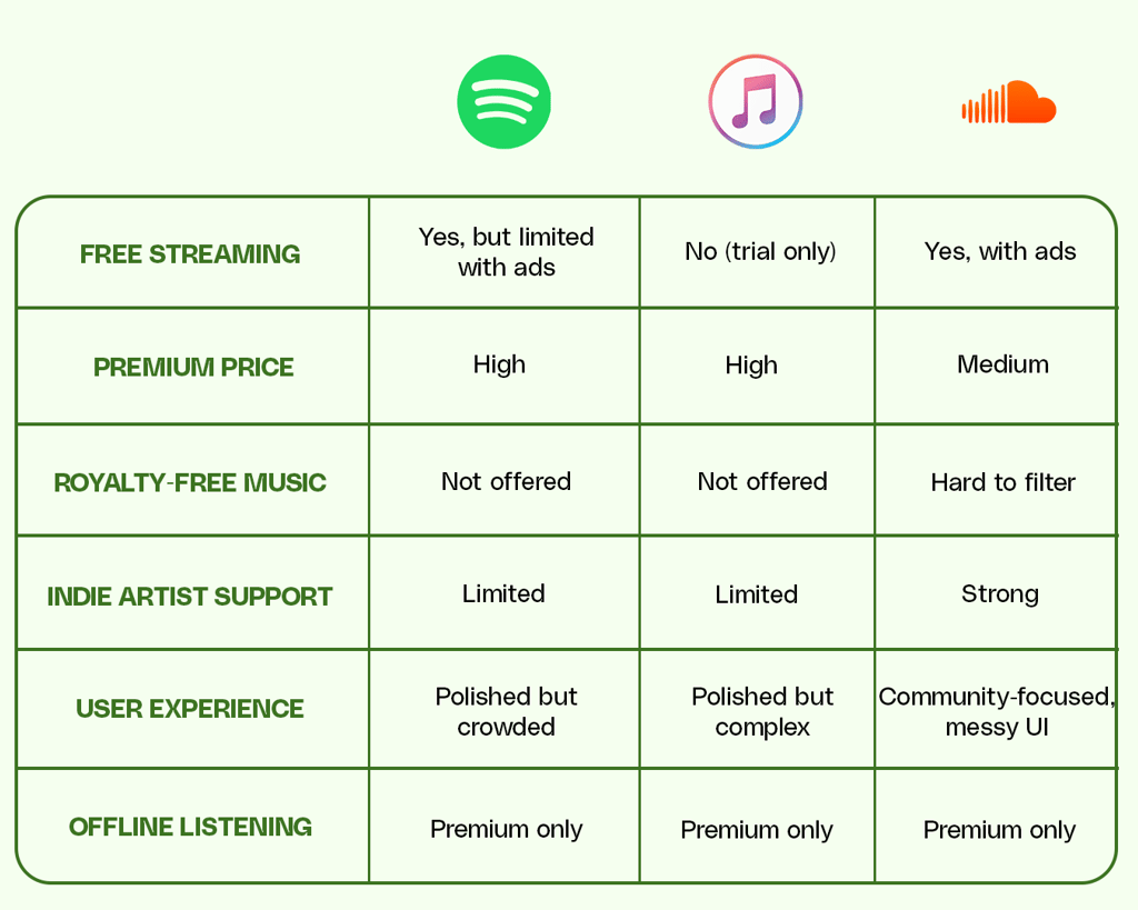
competitive analysis
To better understand the streaming landscape, I conducted a competitive analysis of major platforms such as Spotify, Apple Music, and SoundCloud. This analysis highlighted a clear opportunity for Chime: to position itself as a budget-friendly, inclusive alternative by offering free streaming, a library of royalty-free music, and a simpler, less cluttered user experience.
user research
To better understand the audience for Chime, I conducted a mix of surveys and informal interviews with potential users, including students, indie music fans, and small content creators. The goal was to uncover their listening habits, frustrations with current streaming services, and expectations from a fair, affordable platform.
pain points


High Subscription Costs
Premium plans are too expensive for students and budget-conscious listeners.
Restrictive Free Access
Free tiers often include constant ads, limited skips, and reduced audio quality.
Lack of Royalty-Free Music
Content creators struggle to find affordable, easy-to-license tracks for their projects.
Cluttered Interfaces
Overloaded designs make navigation confusing and discovery less enjoyable.
Limited Indie Artist Exposure
Independent musicians have few opportunities to be discovered alongside mainstream artists.
Personas
After gathering insights from research, I synthesized the data into three idealized personas. These personas represent Chime's core audience segments, each reflecting unique goals, frustrations, and needs uncovered during the discovery stage.


Alex—The Student Listener
"I love music, but I can't afford to pay a monthly fee just to skip ads or listen offline."
Age: 20
Occupation: Student
Goals:
Listen to music daily without worrying about cost
Discover new songs to match moods and study sessions
Frustrations:
Can't afford premium subscriptions
Free tiers are full of ads and restrictions
Needs:
Free, accessible streaming with minimal limitations
A clean interface for quick access to playlists


Maya—The Indie Music Enthusiast
"I want to discover new artists, not just listen to the same top 40 songs everyone else is hearing."
Age: 27
Occupation: Freelance Designer
Goals:
Discover emerging artists and fresh sounds
Support independent musicians
Frustrations:
Feels mainstream platforms prioritize popular hits over indie talent
Difficult to explore new genres without being pushed to top charts
Needs:
Strong music discovery tools
Exposure to indie artists and curated playlists beyond the mainstream


Ryan—The Content Creator
"Finding royalty-free music is so frustrating; either it's too expensive or the tracks sound generic."
Age: 31
Occupation: Youtuber/Podcaster
Goals:
Find royalty-free music quickly for videos and podcasts
Keep costs low while producing consistent content
Frustrations:
Licensing music is confusing and expensive
Free tracks are often low quality or overused
Needs:
Easy access to a royalty-free music library
Affordable premium option with high-quality downloads
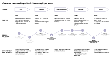
user journey map
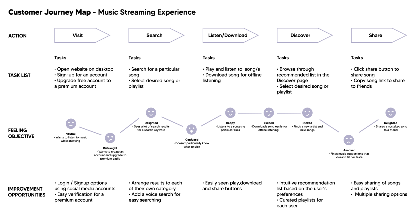
To better visualize how users would interact with Chime, I created a user journey map. This process allowed me to map out the user's motivations, actions, emotions, and potential frustrations at every step. The journey map provided a clear foundation for designing an intuitive flow that directly addresses user needs.
🎧 Develop
In the develop stage, I began turning research insights into tangible design ideas. I first created a sitemap to establish clear navigation flows and ensure users could easily discover music, create playlists, and explore subscription options. Next, I sketched paper wireframes to quickly explore different layouts and interaction patterns, focusing on simplicity and accessibility. These sketches were then translated into a low-fidelity prototype, which allowed me to test user flows and gather early feedback before moving into high-fidelity designs. This stage was crucial in shaping Chime's foundation, ensuring that usability and clarity were prioritized from the very beginning.
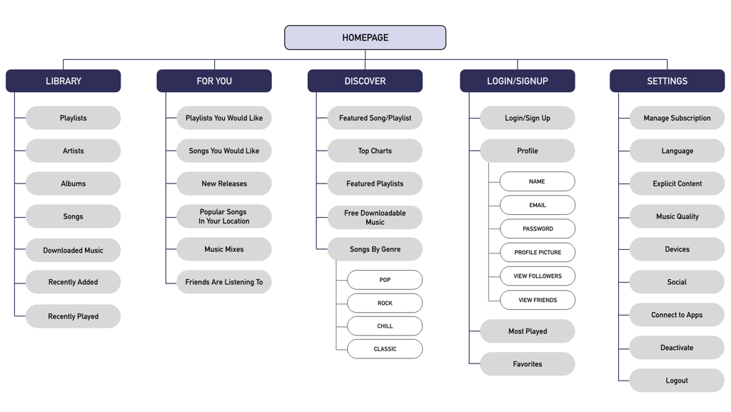
sitemap
I created a sitemap to establish clear navigation and user flows for Chime. It outlined the main sections: Homepage, Library, For You, Discover, Login/Signup, and Settings, ensuring users could easily browse music, manage playlists, and explore subscription options. This helped simplify the structure and guide the design of intuitive pathways throughout the app.
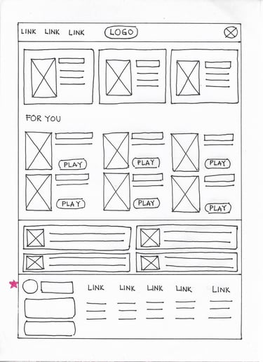
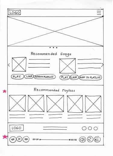
paper wireframes
To quickly explore layout ideas, I began with paper wireframes. Sketching multiple variations of the home screen, discovery page, and playlist flow allowed me to experiment freely without being limited to digital tools.
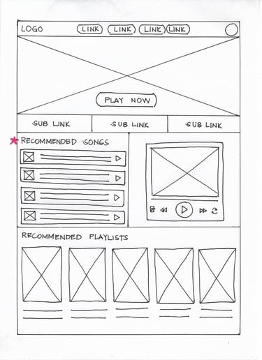
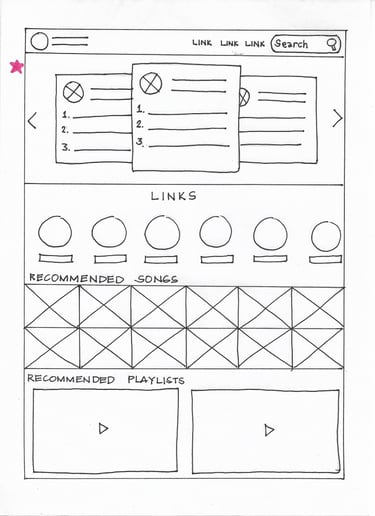
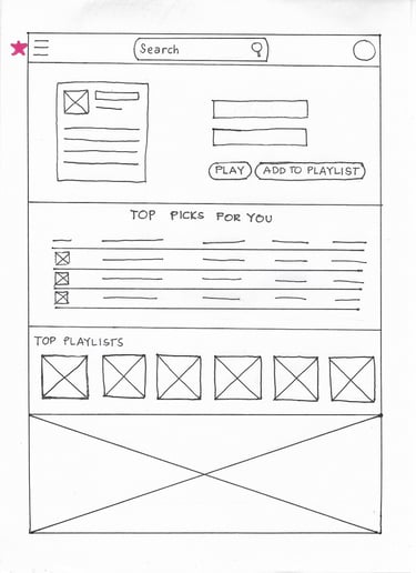
low-fidelity prototype
After refining my paper sketches, I translated them into a low-fidelity digital prototype to visualize Chime's core user flows. This version focused on structure and functionality rather than visuals, allowing me to test navigation across key screens. By keeping the design minimal, I was able to quickly validate usability, gather feedback, and make iterative improvements before moving on to high-fidelity designs.
low-fidelity wireframes
low-fidelity prototype
🎧 Deliver
In the deliver stage, I translated insights and wireframes into polished UI designs with a clean, modern look that emphasized simplicity and ease of use. I incorporated accessibility considerations to make the app inclusive for all users. These elements were brought together in a high-fidelity prototype, showcasing realistic interactions and responsive layouts. To validate the design, I conducted a usability study, gathering feedback on the user flow. Based on these insights, I made several revisions to improve clarity, streamline interactions, and ensure a smoother overall experience.
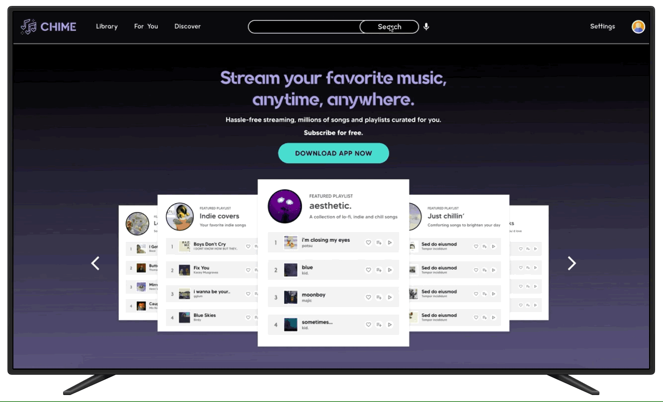
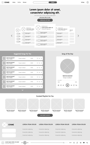
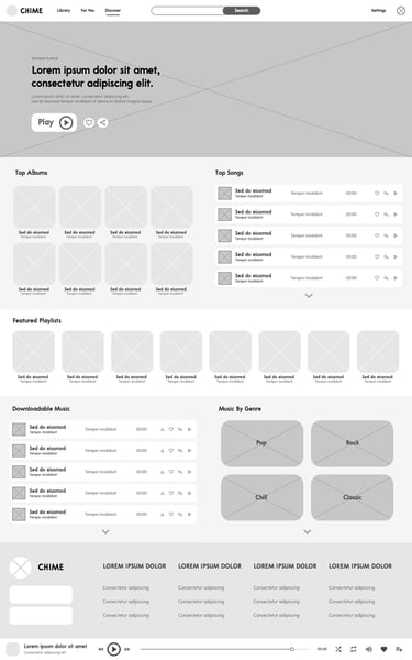
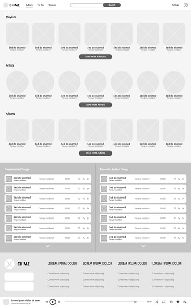
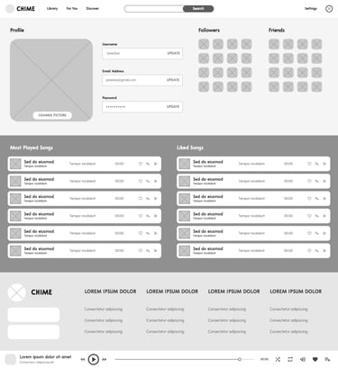
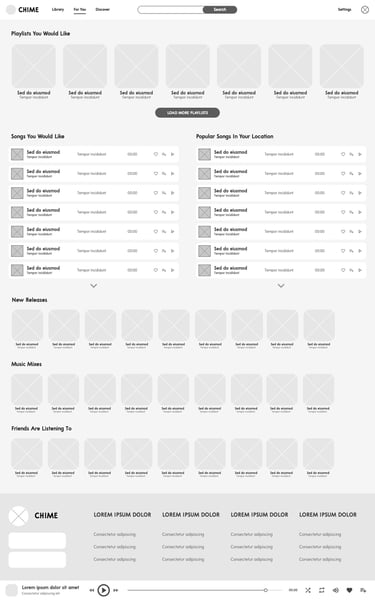
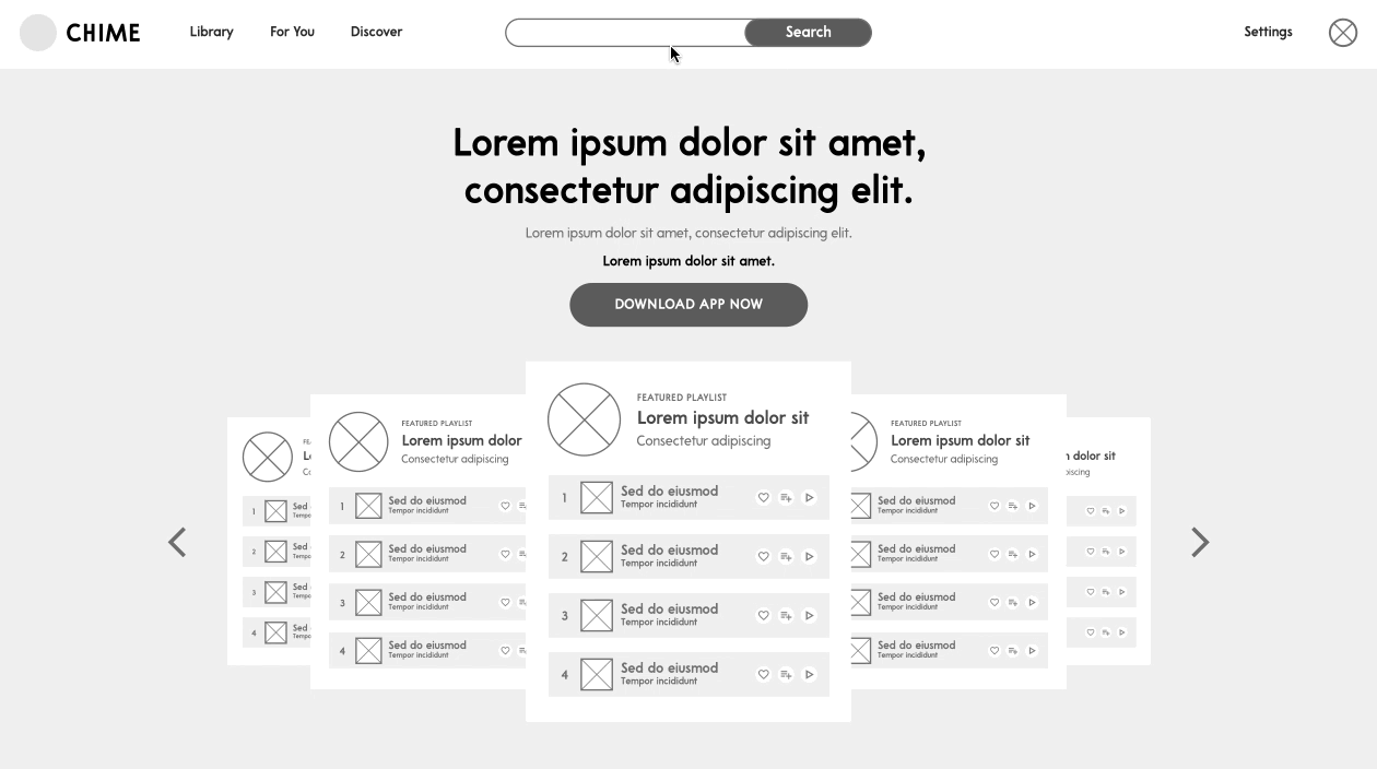
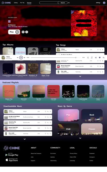
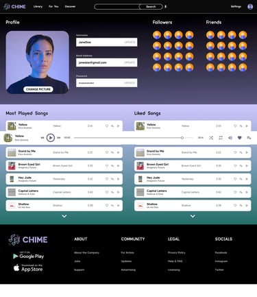
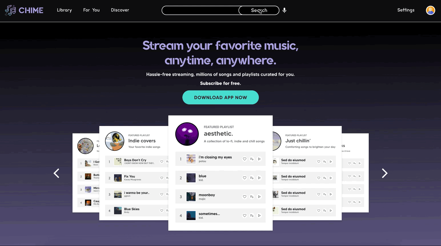
ui design
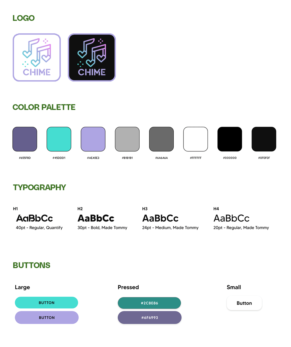
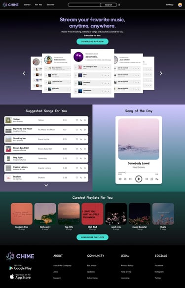
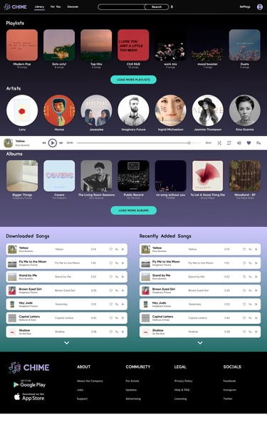
The UI design for Chime centered on a clean, modern aesthetic that puts music at the forefront. I used a black background to create contrast and highlight album artwork, paired with purple accents to convey creativity and energy. To balance the palette, I added turquoise highlights that bring freshness and vibrancy to key actions. Alongside the interface, I also designed the Chime logo, a simple yet distinctive mark inspired by music notes and pixels, reflecting the app's focus on accessibility and music discovery. Together with rounded elements, consistent spacing, and clear typography further enhance usability, resulting in an interface that feels both stylish and intuitive.

accessibility considerations
Accessibility was a guiding principle in designing Chime, ensuring that music streaming is enjoyable and inclusive for all users. Accessibility is not just about compliance; it's about making the app usable, welcoming, and fair for everyone.
Here are some considerations I've taken note of:
☑️ Color Contrast
Black background with purple/turquoise accents designed for WCAG-compliant contrast
☑️ Icon + Text Labels
Clear iconography paired with labels for better comprehension
☑️ Touch Targets
Buttons and controls sized for easy use on both desktop and mobile
☑️ Consistent Navigation
Logical structure and predictable patterns across all screens
☑️ Alt Text Support
Space for album covers and artwork descriptions for screen readers
usability study
To evaluate Chime's design, I conducted a usability study with a small group of target users who tested the high-fidelity prototype. Participants were asked to complete core tasks such as searching for a song, downloading, and exploring the premium upgrade flow. The study revealed valuable insights.
Insights

Song/Playlist Options
Users wanted more flexibility when managing songs and playlists
Search Function
Users suggested an easier way to find songs without typing
Playback Controls
Users wanted more control over how they listen
revisions
Based on the insights gathered from the usability study, I made several key revisions to enhance Chime's overall experience. These revisions ensured that Chime not only looked visually polished but also aligned more closely with user needs and expectations.
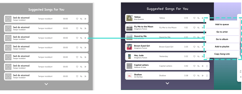
revision #1: expanded song options
Before Usability Study
After Usability Study
revision #2: voice search
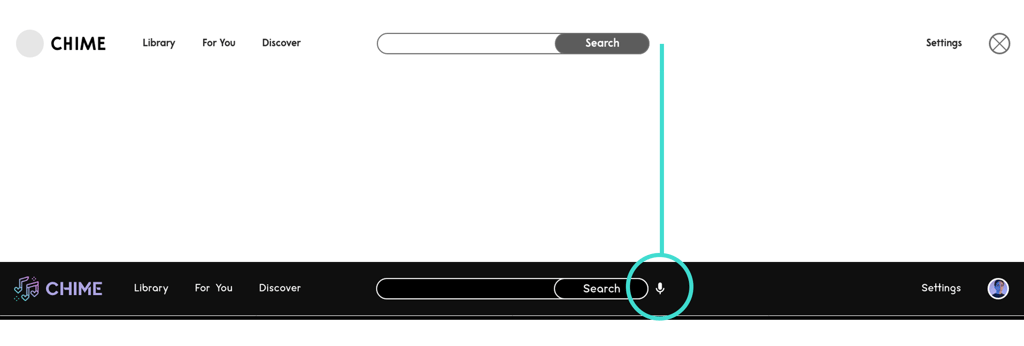
Before Usability Study
After Usability Study
revision #3: Shuffle play
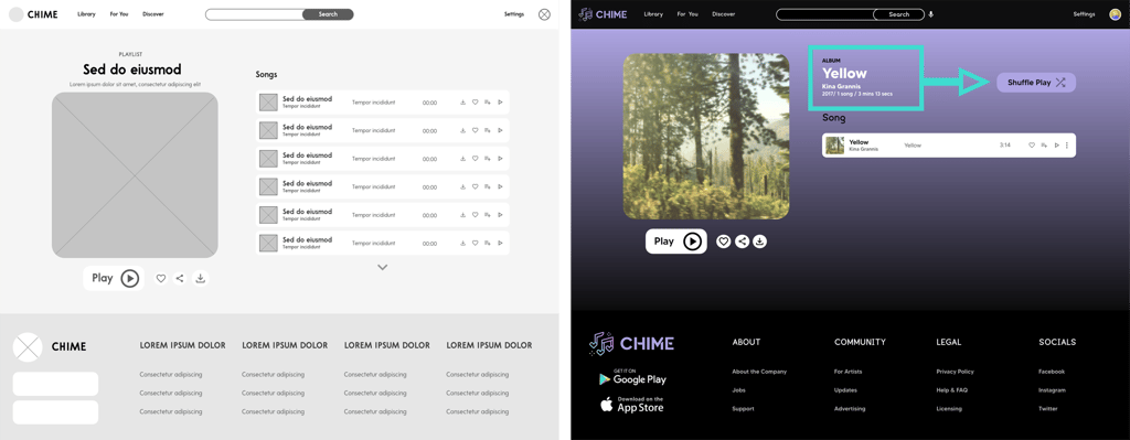
Before Usability Study
After Usability Study
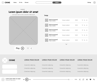
high-fidelity prototype
The final high-fidelity prototype showcases Chime as a polished, interactive music streaming platform ready for real-world use. Every element was carefully designed to create a modern yet approachable look. By integrating user feedback and accessibility best practices, the final high-fidelity prototype delivers a visually striking and intuitive experience that captures Chime's goal of making music streaming free, flexible, and enjoyable for everyone.
high-fidelity wireframes

high-fidelity prototype
To give users more flexibility and control, I added an expanded set of options for each song, including Add to Queue, Go To Artist, Go To Album, Add to Playlist, and Copy Song Link. These additions make it easier for listeners to manage their music seamlessly, discover related content, and share tracks with others, ultimately creating a richer and more engaging experience within Chime.
To make discovering music faster and more accessible, I integrated a voice search feature in Chime. This allows users to simply speak the name of a song, artist, or album instead of typing, reducing friction and making the app more convenient, especially for those on the go or users with accessibility needs.
To enhance the listening experience, I added a Shuffle Play option on playlists. This gives users more control and variety, allowing them to enjoy their music in a fresh, randomized order without having to manually rearrange tracks.
🎧 Going Forward
I realized how important it is to listen to users early on and not rely only on my assumptions.
Small details, like button placement and playback options, showed me how even subtle changes can make a big difference in the overall experience.
This project challenged me to balance creativity with practicality, making sure the design looked great but also worked smoothly.
I became more aware of how accessibility matters and how thoughtful choices can make the app usable for everyone.
Moving from sketches to a high-fidelity prototype gave me confidence in my process and ability to iterate effectively.
Working on Chime taught me the value of designing with users at the center. From research to prototyping, I learned how critical it is to validate assumptions and continuously refine based on feedback.
takeaways
next steps
Conduct usability testing with a larger and more diverse group of users.
Explore additional features such as personalized recommendations, social sharing, and offline listening.
Refine playlist management and discovery features for smoother user flow.
Continue improving accessibility to ensure an inclusive experience for all users.
Prepare the design for potential real-world implementation and scalability.
Let’s start your next project together.
ⓒ 2025 — Guylaine Bernardez