Creating an intuitive mobile interface for fresh food on-the-go
🍱 Project Overview
FreshBox aims to provide a seamless, reliable, and convenient online food delivery service that connects customers with fresh, high-quality meals and groceries from trusted restaurants, local markets, and independent food providers. The project's goal is to make healthy, delicious, and affordable food accessible with just a few clicks.
Duration
My Role
Tools
The Challenge
Objectives/Goals
3-4 weeks
UX/UI Design, Visual design, Branding, User flow, Research, Prototyping, and Testing
Figma, Miro, Zoom, Google Forms
FreshBox was created to solve a common problem: most food delivery apps only focus on takeout, while grocery delivery services often lack speed and flexibility. Users wanted a platform that could do both: deliver fresh meals and groceries without compromising on convenience, health, or sustainability. The challenge was to design a service that brings variety, reliability, and personalization together in one seamless experience.
Convenience
Make it simple for users to order both meals and groceries in one place.
Healthy Options
Provide fresh, nutritious choices tailored to different dietary needs.
User Experience
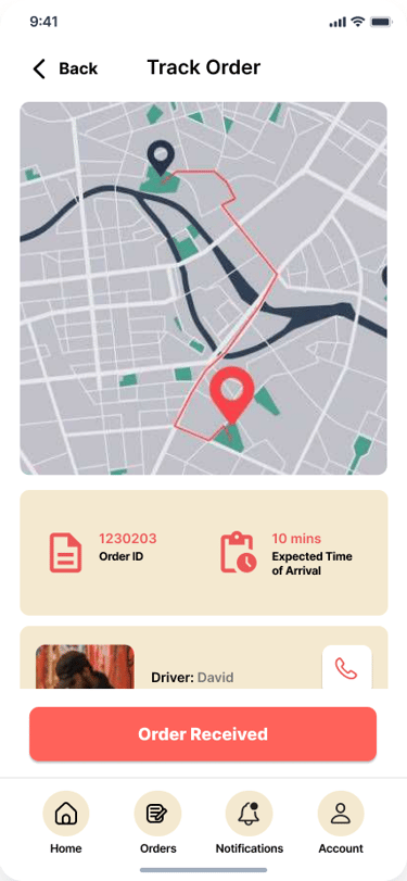
Create an intuitive, smooth platform with real-time order tracking.
Sustainability
Partner with local suppliers and use eco-friendly packaging.
Customer Loyalty
Build trust through reviews, personalized recommendations, and rewards.
Scalability
Launch locally, then expand while maintaining quality and consistency.
My Design Process
User Research
Competitive Analysis
Affinity Diagram
Personas
User Journey Map
Storyboard
User Flow
Paper Wireframes
Mid-fidelity Prototype
UI Design
Usability Studies
Iterations
Takeaways
Next Steps
Accessibility Considerations
High-fidelity Prototype
🍱 Discover
The project began with a deep dive into understanding user needs and the food delivery landscape. Through user research, I gathered insights on customer frustrations. A competitive analysis helped highlight gaps in existing platforms, reinforcing the opportunity for a more holistic service. From these insights, I created personas to represent key user groups. To visualize their experience, I mapped out a user journey, which uncovered pain points and opportunities at every stage. This foundation guided the design direction and ensured the solution was rooted in real user needs.
user research
To ground the project in real user needs, I conducted user research through surveys and short interviews with potential customers. The goal was to understand how people currently order food and groceries, what frustrates them, and what features they value the most. Key findings showed that users often felt limited by existing apps; most only catered to restaurant takeout, while grocery delivery lacked speed and variety. Many participants also expressed a desire for healthier, more personalized options that aligned with their lifestyle and dietary needs. These insights shaped the foundation of FreshBox, ensuring the platform addressed real pain points rather than assumptions.
key insights


Flexible Delivery Options
Offer multiple delivery times to match different lifestyles
Add express delivery for quick meals and standard delivery for larger grocery orders
Enhanced App Features
Advanced search filters
Personalized recommendations based on past orders and dietary profiles
Customer Engagement
Discounts, promotions, and bundle deals to encourage repeat use
Clear customer reviews and ratings to build trust in food quality
Recommendations
Need for a recommendation list for easy ordering
Menu options such as discounted meals, ingredients, and best sellers
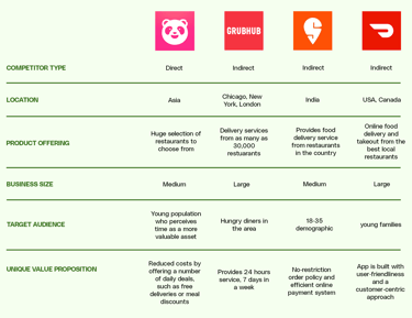
competitive analysis
To better position FreshBox in the market, I conducted a competitive analysis of leading food delivery and grocery apps. While most competitors excelled at offering restaurant takeout, they often lacked healthy choices, personalization, and flexibility in delivery options. Grocery delivery platforms, on the other hand, provided variety but were slower and less user-friendly. Few competitors combined both services in a single seamless experience. This analysis revealed a clear opportunity for FreshBox to stand out by bridging the gap—offering fresh meals and groceries together, supported by faster delivery times, advanced search filters, personalized recommendations, and sustainable practices.

affinity diagram
After gathering insights from user research, I used an affinity diagram to organize and group recurring themes. By clustering pain points and needs into categories, patterns became more visible. This process helped them transform scattered feedback into clear focus areas, showing where FreshBox could create the most value. The affinity diagram acted as a bridge between raw research and design direction, guiding the development of personas, user journeys, and ultimately the features that shaped the platform.
user journey map
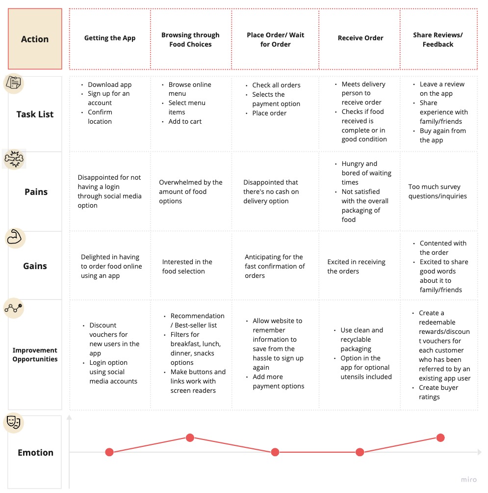
To visualize how users interact with FreshBox, I created a user journey map that outlined each stage of the experience. The map highlighted key touchpoints such as getting the app, browsing through food choices, placing and waiting for their order, receiving the order, and sharing reviews, as well as the pains and gains, improvement opportunities, and their emotions at each step. This mapping exercise uncovered opportunities to simplify checkout, enhance personalization, and make delivery updates more transparent, directly shaping the features and flow of the platform.
personas
To better understand FreshBox's target users, I created personas based on research insights and affinity diagram themes. These personas represented key user groups. Each persona included goals, frustrations, and daily habits, which helped keep the design focused on real needs rather than assumptions. By grounding the design in these personas, I was able to prioritize features like flexible delivery times, advanced filters, and simplified checkout flows.


Name: Gretchen
Age: 37
Occupation: Event Coordinator
“I want the best for my family, especially in the food they eat.”
Gretchen Reyes is an event coordinator at Bonifacio Global City. As a working mom, she balances her time focusing on work and raising her children, ages 5 and 8. She and her husband both have full-time jobs, and when times get busy, it is hard for them to cook and prepare meals for the whole family. Despite the situation, she doesn’t want to compromise her family’s health and is conscious about what they consume. She wants a variety of food to choose from because her kids are quite picky eaters. Moreover, it is also important to her that the food is delivered warm, fresh, and of the best quality.


“I love to eat tasty food at any time I want but at a low cost.”
Name: Paul
Age: 21
Occupation: Student
Paul Tan is a 3rd-year computer science student and loves to eat. He has a busy schedule, as he also works as a student assistant and has a tough college life. Due to his packed routine, he oftentimes dines out or orders his food online. He particularly is passionate about the idea of 24/7 food delivery, especially since he constantly craves something to eat on late study nights. He likes tasty food but still has to be on a low budget.
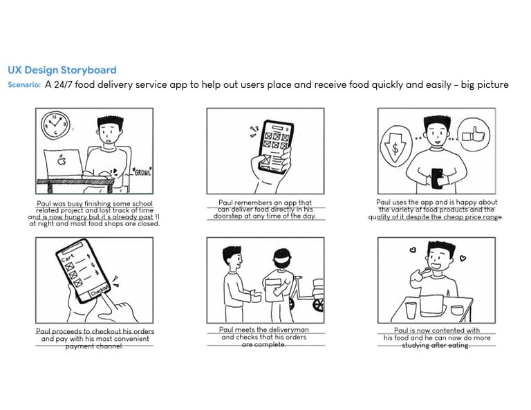
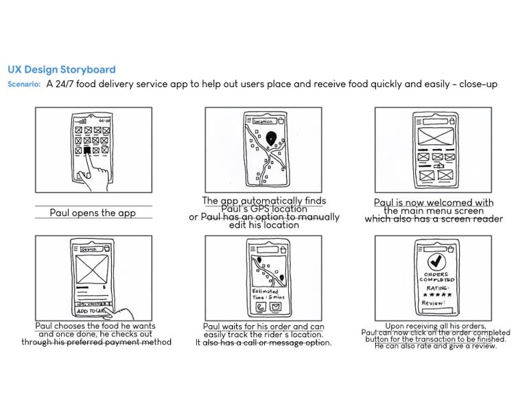
storyboards
The storyboard was created on two levels: the big picture and the close-up. The big picture shows Paul, a busy university student, managing classes, late-night study sessions, and a limited budget, often struggling to find affordable and convenient food options. The close-up zooms in on Paul's direct interaction with FreshBox. This layered approach captures both the broader challenges in Paul's daily life and the specific touchpoints where FreshBox delivers value, ensuring the design is grounded in real user needs.
🍱 Design
In the design stage, I translated research insights into tangible solutions, starting with a user flow that mapped the steps from browsing meals and groceries to placing an order and tracking delivery. This helped ensure the experience was simple and intuitive. I then sketched paper wireframes to quickly explore layout ideas and core interactions. Building on these, I developed a mid-fidelity prototype to test navigation, filtering, and checkout flows without the distraction of visuals. Finally, I refined the interface with a polished UI design, using a clean, modern aesthetic to emphasize freshness, trust, and accessibility. Each stage built on the last, gradually shaping FreshBox into a seamless, user-centered platform.
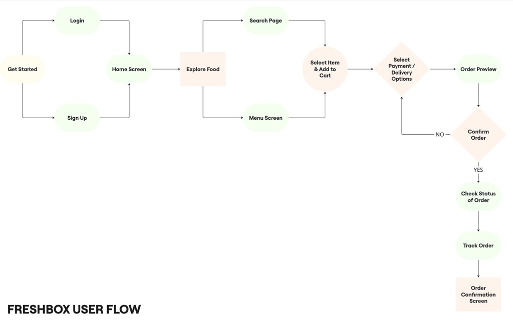
user flow
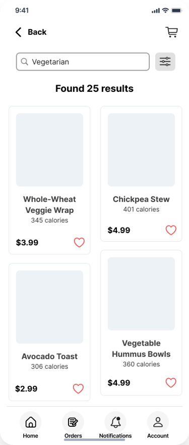
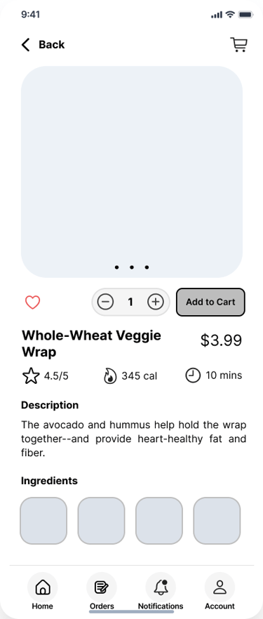
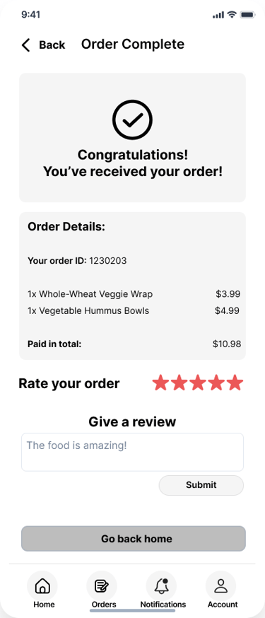
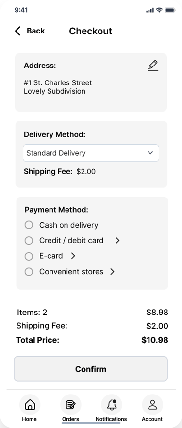
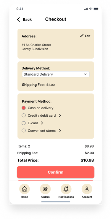
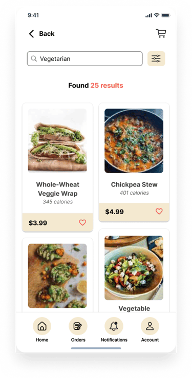
The user flow was designed to keep the ordering process simple and efficient, reducing friction at every step. Starting from the home screen, users can explore food options through the search option or by browsing through the main screen. Once a product is selected, they can view details, adjust quantity, and add it to the cart. The flow then moves to checkout, where users can select their payment and delivery options. Finally, the order is confirmed and tracked in real time until it is delivered. This streamlined flow ensures that users like Paul can get from search to order completion in just a few clear steps, without unnecessary complexity.
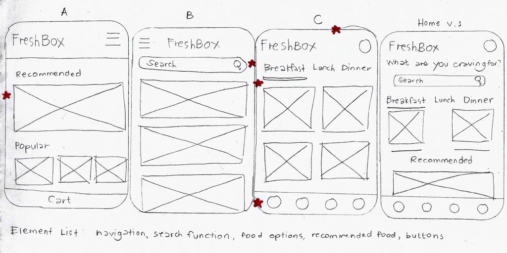
paper wireframes
To quickly explore ideas and visualize the layout, I began with paper wireframes. These low-cost sketches allowed me to experiment with different arrangements for the home screen, product listings, and checkout flow before moving into digital tools. I focused on keeping navigation simple, with clear categories, prominent search options, and an easy path to the cart.
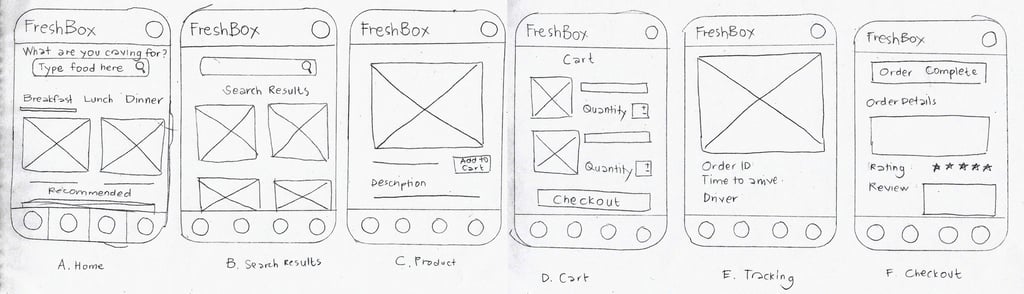
mid-fidelity prototype
After sketching paper wireframes, I moved into mid-fidelity wireframes, focusing on structure, layout, and user flows without the distraction of color branding. These wireframes mapped out key screens such as the home page, product listings, item details, cart, and checkout. I then connected the wireframes into an interactive prototype, allowing users to click through and experience the journey from browsing to placing an order. This stage was crucial for testing navigation, refining the checkout process, and validating that the overall flow was intuitive before investing in high-fidelity visuals.
mid-fidelity wireframes
mid-fidelity prototype
ui design
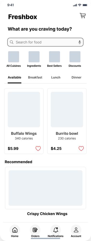
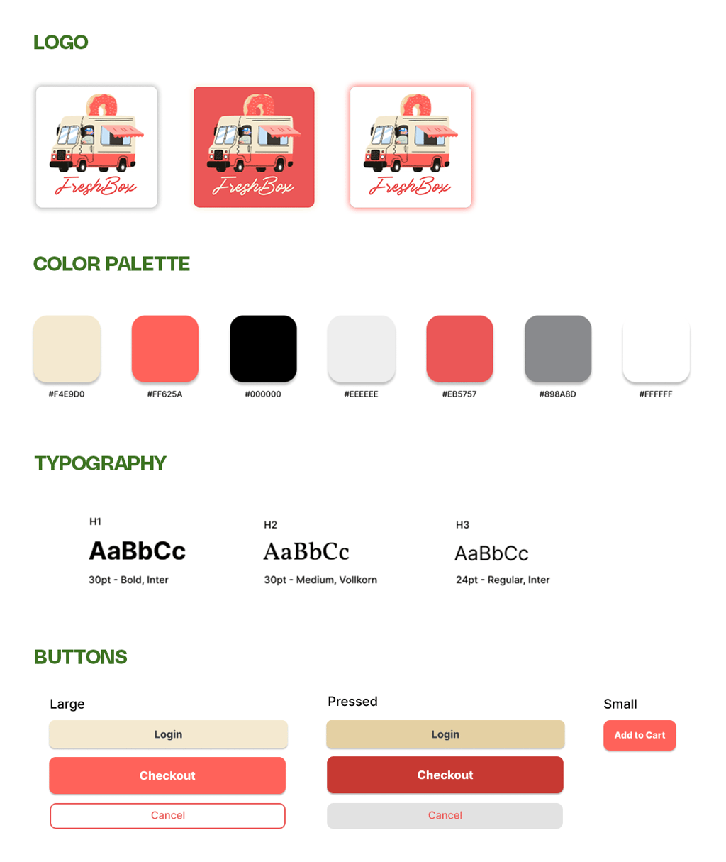
In the final design stage, I transformed the mid-fidelity prototype into a polished UI design that reflects FreshBox's identity and values. I chose a warm color palette of yellows and reds to evoke freshness, energy, and appetite appeal, while also helping the brand stand out in a competitive market. Clear, legible fonts and a clean layout were used to prioritize readability and guide users smoothly through the experience. Buttons and key actions were designed with strong contrast for accessibility, while spacing and hierarchy ensured that navigation remained intuitive. The overall interface balances vibrancy and simplicity, creating a friendly and trustworthy feel for users.

🍱 Validate
In the validate stage, I conducted usability studies to assess how well the design supported users in completing key tasks such as searching for meals, applying filters, adding items to the cart, and checking out. Participants provided feedback on ease of navigation, clarity of delivery options, and overall satisfaction with the flow. Insights from the study highlighted areas for improvement. Based on these findings, I made iterations to streamline interactions and address pain points, ensuring the final design was not only functional but also intuitive and user-friendly.
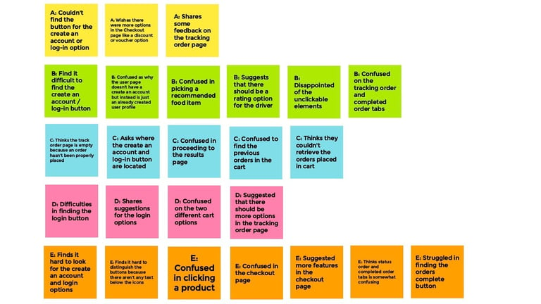
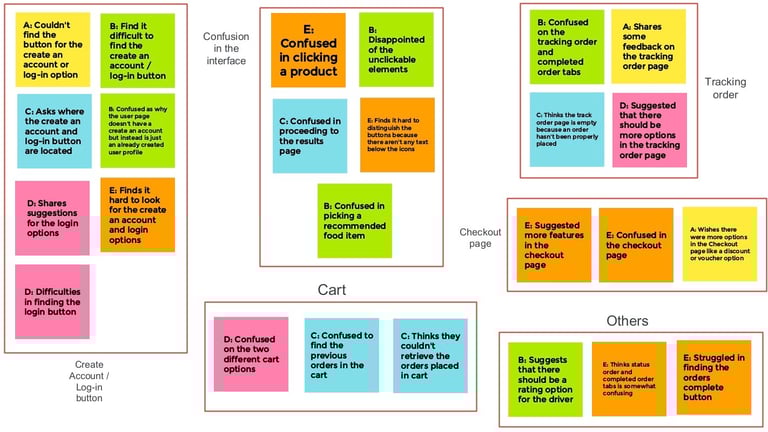
usability study # 1
The first round focused on core task completion: browsing meals, adding items to the cart, and completing checkout. Feedback from this study revealed opportunities to improve.
key insights


Users need an easier register and login option
Users need a reorder feature and an easy list option
Users need labels for buttons and search suggestions
usability study # 2
After making targeted iterations, I conducted a second round of testing that emphasized refinement, evaluating whether the updated flow felt smoother, faster, and more intuitive. This final round confirmed that the adjustments improved usability and reduced friction, ensuring FreshBox delivered a seamless and reliable ordering experience.
key insights
A popup shown when a product is added to the cart is needed
An additional checkout confirmation popup upon checkout is useful
A like section on the user page is helpful in finding the user's clicked likes
iterations
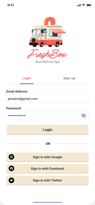
Based on usability feedback, I refined key areas of the design to improve clarity and efficiency. Updates included a dedicated page for a login/register option, an easy search feature, and a confirmation popup. These iterations streamlined the experience and directly addressed user pain points, making FreshBox more intuitive and reliable.
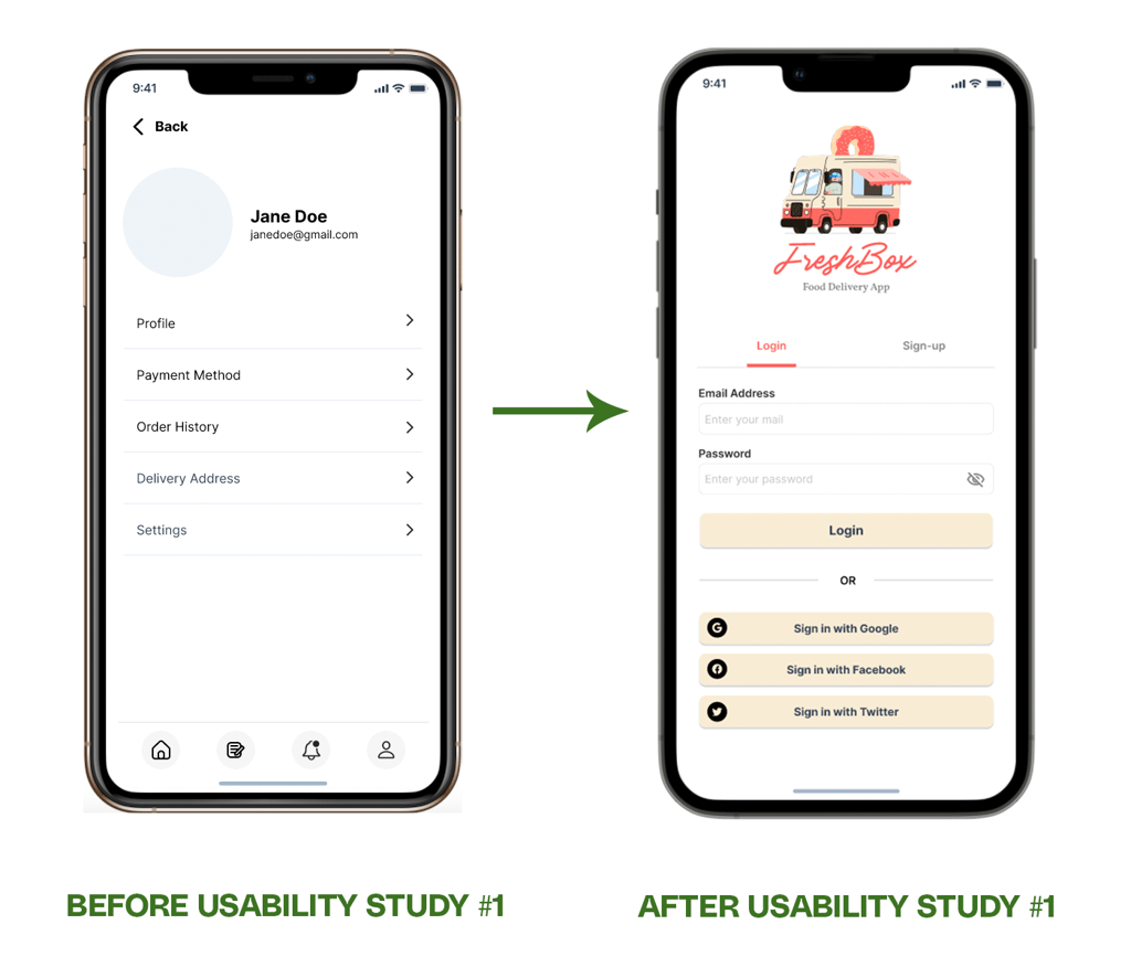
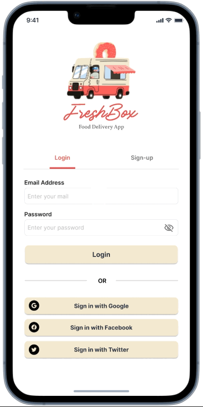
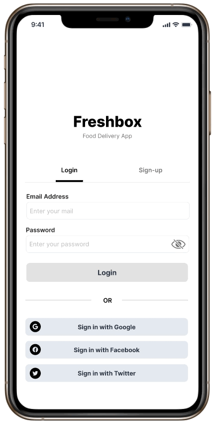
The early design doesn’t contain a dedicated page for a login or register option, but after the first usability study, a separate page was created solely for either logging in or registering through the app using the traditional email-password method or through the social media sign-in method.
iteration #1: adding a login/signup page
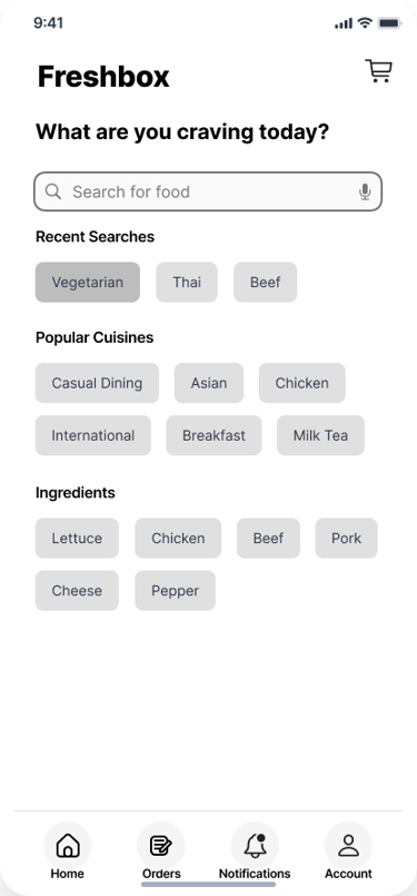
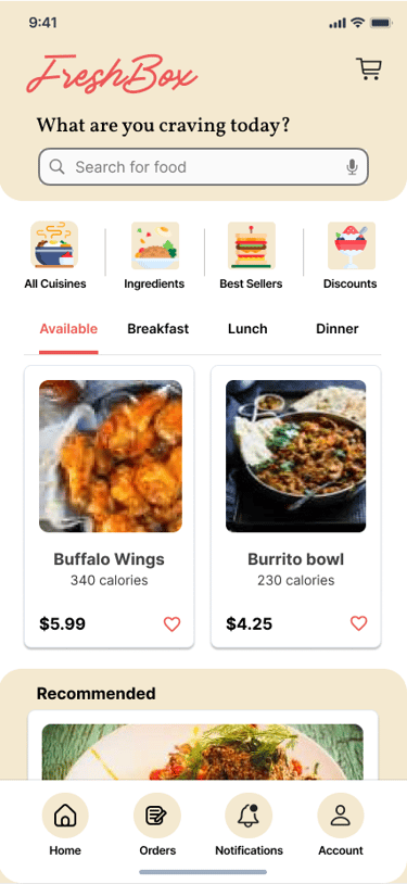
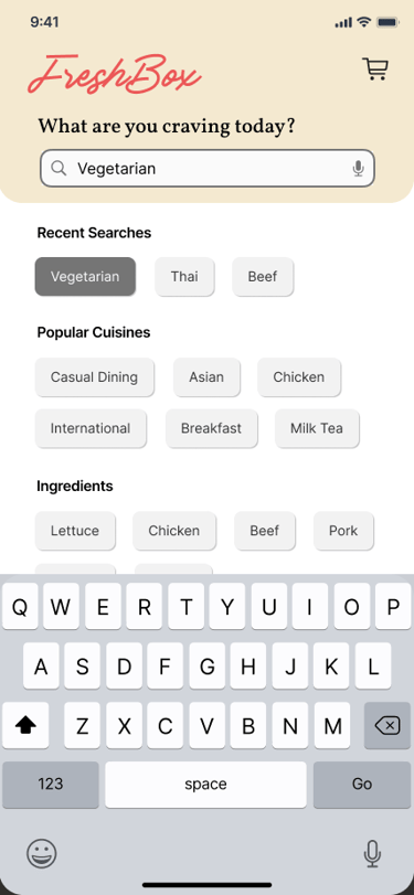
iteration #2: adding an easy search feature
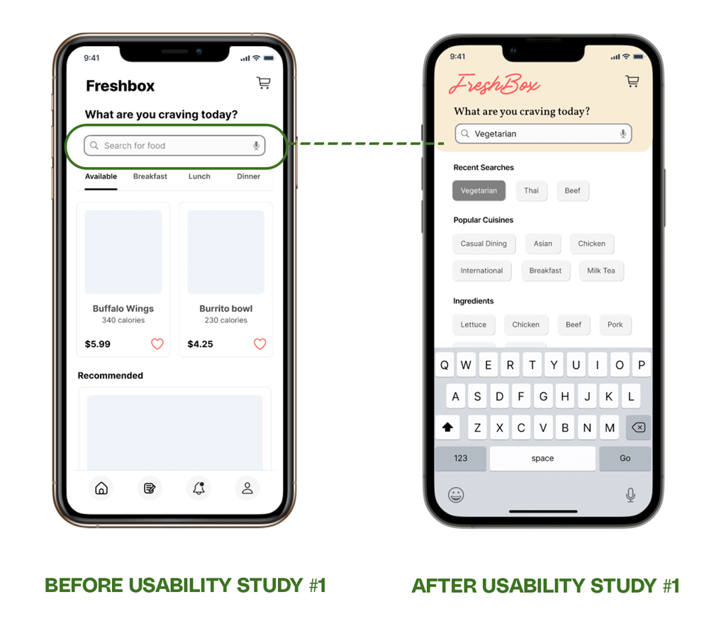
The search function also doesn't allow for an easy search feature, and the early design did not have a keyboard feature, which made it confusing for users to do a search. The easy search feature contains recent searches, popular cuisines, and categories like ingredients, etc.
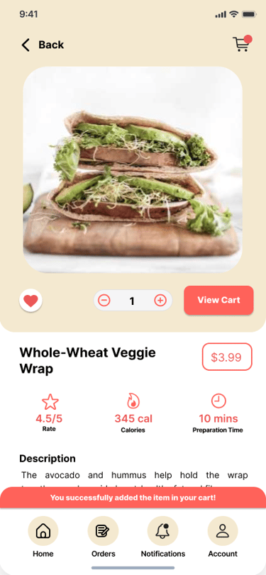
iteration #3: adding a confirmation popup
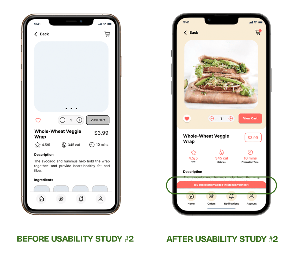
For the second usability study, users find it helpful if a popup confirming a product is added to their cart is shown every time they add a product to their cart. For this, I added a red dot beside the cart button and a popup message saying that the user successfully added the product to the cart to easily indicate that the action is done.
🍱 Deliver
In the deliver stage, I focused on ensuring the product was both inclusive and polished. Accessibility considerations were built into the design. These practices aimed to make FreshBox usable for a wider range of users, including those with visual or motor limitations. The process concluded with the creation of a high-fidelity prototype, showcasing the complete end-to-end experience with a vibrant UI, refined interactions, and smooth navigation. This final prototype embodied the project's goals: an intuitive, reliable, and engaging platform for food delivery.
accessibility considerations
To make FreshBox inclusive and user-friendly, I integrated accessibility best practices throughout the design. These considerations helped create a smoother, more reliable experience for all users, including those with visual, motor, or cognitive limitations.


Provided a speech recognition feature in the easy search function for users who have mobility impairments to use.
Used icons and labels to help make navigation easier.
Provided access to users who are visually impaired by adding alt text to images for screen readers.
final high-fidelity prototype
The high-fidelity prototype brought FreshBox to life with a polished UI, smooth interactions, and a vibrant color palette of yellows and reds that reflected the brand's energy and freshness. It showcased the complete user journey while ensuring consistency, clarity, and accessibility. This prototype served as the final representation of the product, ready for presentation and user testing.


Used detailed imagery for food orders and ingredients to help all users better understand the designs.
high-fidelity wireframes
high-fidelity prototype
🍱 Future Plans
This project taught me how valuable user research is; hearing directly from users gave me insights I wouldn't have uncovered on my own.
Creating personas and journey maps helped me empathize with users like Paul, and I found myself thinking about their needs at every design decision.
Going through usability testing and iterations reminded me that design is never perfect the first time, and small refinements can truly transform the experience.
Focusing on accessibility opened my eyes to how inclusive design makes products not only fairer but also more effective for everyone.
The UI design process was one of my favorite parts, as I enjoyed bringing the brand to life with colors, typography, and layout that made the product feel both vibrant and trustworthy.
Looking ahead, FreshBox can continue to evolve by expanding delivery options and time slots, introducing personalized recommendations, and adding advanced app features like loyalty rewards and subscription meal plans. Further research and usability testing will help refine these ideas, ensuring the platform grows with user needs and remains competitive in the food delivery space.
takeaways
next steps
Conduct further usability testing with a larger and more diverse group of users to validate design decisions.
Explore adding new features such as loyalty rewards and subscription meal plans to enhance engagement.
Collaborate with developers to ensure design handoff and technical feasibility of all interactions and accessibility features.
Research opportunities for partnerships with local restaurants and groceries to broaden FreshBox's offerings.
Let’s start your next project together.
ⓒ 2025 — Guylaine Bernardez