Developing a convenient and delightful coffee ordering journey
☕️ Project Overview
Hue Coffee aims to create a website that not only strengthens its online presence but, more importantly, makes it easy for customers to order and pick up coffee. The website will act as a digital storefront where customers can browse the menu, place orders ahead of time, and conveniently schedule pickups. This reduces wait times, improves customer experience, and encourages repeat visits from busy professionals, students, and coffee lovers on the go.
Duration
My Role
Tools
The Challenge
Objectives/Goals
3-4 weeks
UX/UI Design, Visual design, Branding, User flow, Research, Prototyping, and Testing
Figma, FigJam, Zoom, Google Forms
Hue Coffee attracts a busy crowd of students, professionals, and commuters who often don't have time to wait in line. Without an easy way to order ahead, customers face long waits during peak hours, leading to frustration and missed sales. The cafe needed a website that not only reflects its brand but also makes ordering and pickup quick and convenient.
The website for Hue Coffee is designed with the following goals in mind:
Streamline the Ordering Process
Enable customers to easily browse the menu, customize drinks, and place orders online for faster pickup.
Enhance Customer Convenience
Provide a quick and reliable way for busy commuters, students, and professionals to grab their coffee without waiting in line.
Strengthen Brand Identity
Reflect Hue Coffee's warm, modern, and community-focused personality through consistent branding, visuals, and storytelling.
Build Customer Loyalty
Lay the foundation for loyalty programs and promotions that encourage repeat visits and long-term engagement.
Expand Future Opportunities
Prepare the platform for future growth, such as delivery services, online sales of coffee beans and merchandise, and community event promotions.
My Design Process
User Research
Competitive Analysis
Personas
User Journey Map
Sitemap
User Flow
Paper Wireframes
Mid-fidelity Prototype
UI Design
Responsive Design
Takeaways
Next Steps
Usability Study
Revisions
High-fidelity Prototype
☕️ Research
The research stage consisted of user research, competitive analysis, persona creation, and user journey mapping. Through user research, I gathered insights into Hue Coffee's audience. Competitive analysis helped identify best practices from other cafes and ordering platforms, highlighting the importance of clear menus and streamlined checkout. Personas were then developed to represent different customer types and their needs, while a user journey map was created to visualize pain points such as long wait times. Together, these insights shaped the project's direction, ensuring the website focused on convenience, speed, and brand consistency.
user research
To better understand Hue Coffee's audience, I conducted user research through casual interviews and observations at the cafe. The findings revealed that most customers were commuters, students, and young professionals who valued high-quality coffee but often struggled with limited time. Many expressed frustration over long waits during peak hours and wanted a faster way to place and pick up orders. These insights confirmed that the website should prioritize a simple, mobile-friendly ordering system that allows customers to quickly view the menu, customize drinks, and schedule pickups.
pain points


Long Wait Times
Customers often face lines during peak hours, leading to frustration and even lost sales
Lack of Order-Ahead Options
There is no way to pre-order drinks, making it inconvenient for commuters or students in a rush
Unclear Menu Access
Customers rely on in-store boards or social media posts, which are not always up-to-date or easy to browse
Limited Customer Engagement
Without a central platform, promotions, events, or loyalty programs are harder to communicate directly to customers
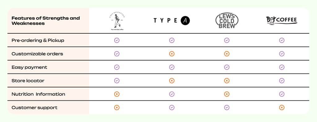
competitive analysis
As part of the research, I looked at both local independent cafes and established chains. Cafe Seventy Six and Type A primarily use social media platforms to share menus and updates, but they lack a dedicated website, which limits customer convenience for ordering ahead. Lew's Cold Brew offers a niche product line with strong branding but focuses more on bottled products rather than an integrated ordering experience. On the other hand, Bo's Coffee provides an online ordering system similar to global competitors, but its platform often feels generic and less personal. These comparisons revealed an opportunity for Hue Coffee to create a website that combines the personal, community-driven feel of local cafes with the ease and efficiency of chain ordering systems.
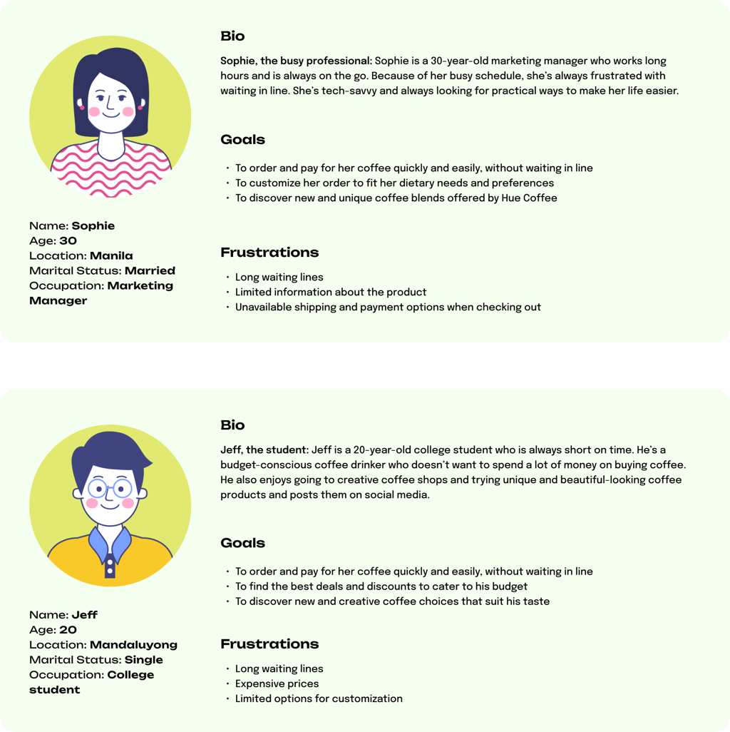
personas
Based on user research, I developed personas to represent Hue Coffee's key customer groups. These included a young professional who values both quality and convenience and a student looking for affordable drinks between classes. These personas helped guide design decisions by keeping the focus on real customer needs and ensuring the website prioritized speed, clarity, and ease of use.

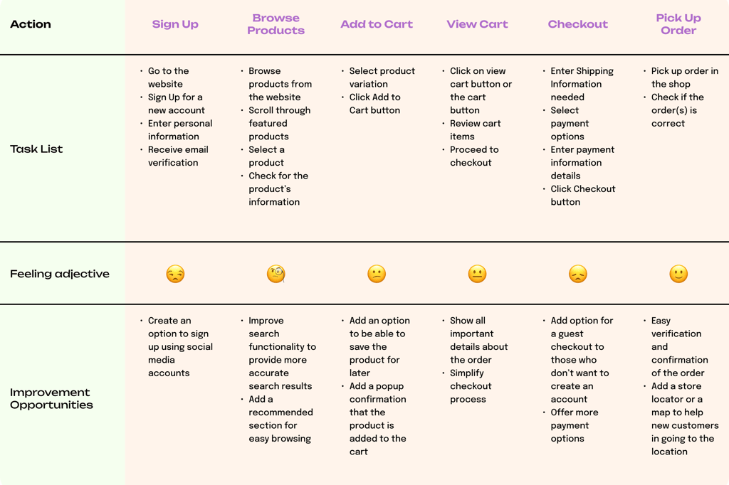
user journey map
To better understand the customer experience, I created a user journey map that visualized how different personas interact with Hue Coffee. The map highlighted key stages such as signing up, browsing products, adding and viewing the cart, checking out, and pickup. This process provided a clear picture of where frustrations occur and how the website could resolve them, ensuring a smoother and more satisfying customer experience.
☕️ Planning
The planning stage translated research insights into a clear structure for the website. I began by creating a sitemap to organize the main sections, prioritizing quick access to the order-ahead feature. A user flow was then developed to map out the steps customers would take from browsing the menu to completing an order. With this foundation, I sketched paper wireframes to experiment with layouts and test ideas quickly. These were refined into a mid-fidelity prototype, which provided a more detailed view of the site's structure and interactions, setting the stage for high-fidelity design.
sitemap
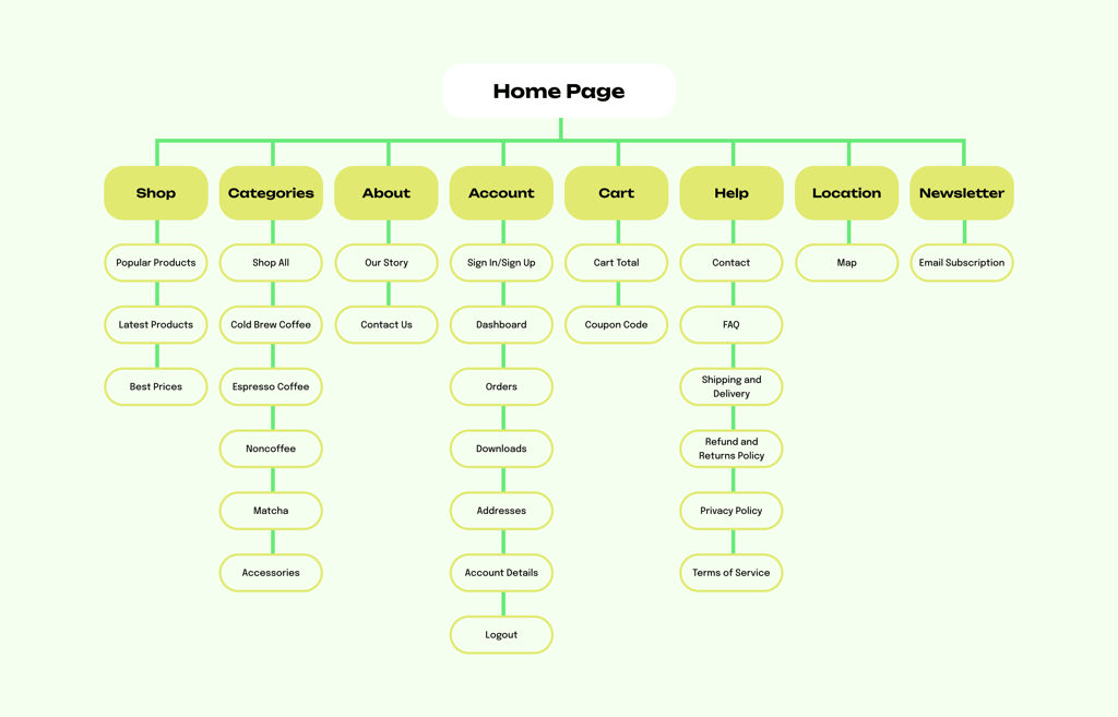
The sitemap outlined the website's main structure—Homepage, Shop, Categories, About, Account, Cart, Help, Location, and Newsletter—with a clear focus on quick access to the ordering feature. This simple, user-centered layout ensured that customers could easily find essential information while keeping the ordering process fast and intuitive.
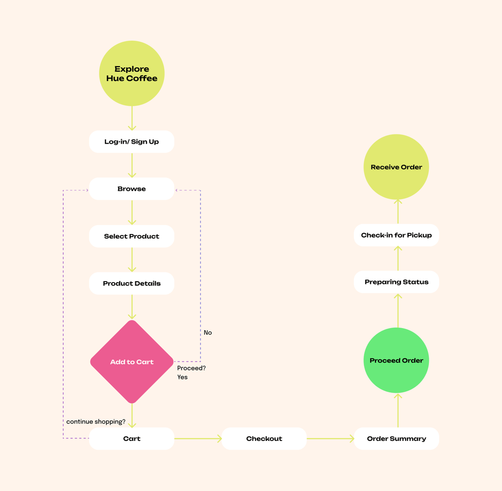
user flow
The user flow mapped the step-by-step journey from landing on the homepage to completing an order for pickup. It emphasized a smooth path—browsing the menu, selecting the product, adding items to the cart, checking out, checking in for pickup, and receiving the order—designed to minimize clicks and reduce waiting time for busy customers.

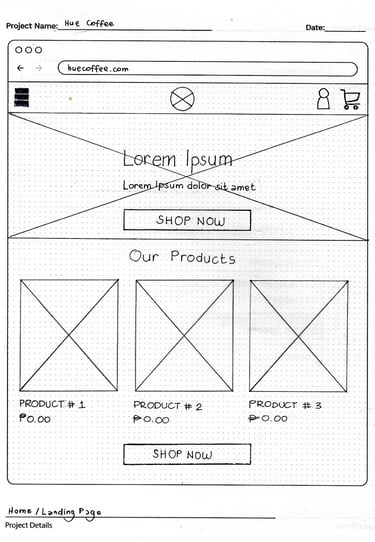
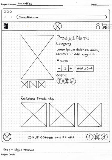
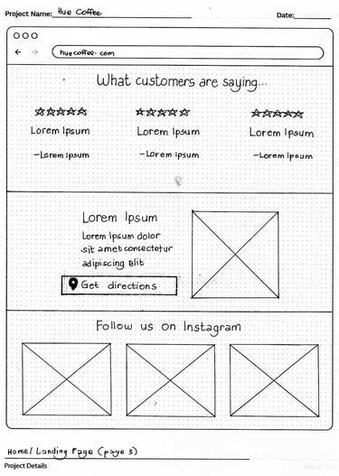
paper wireframes
I sketched paper wireframes to quickly explore different layout ideas for the homepage, menu, and ordering screens. This low-cost, flexible approach made it easy to experiment with placements and prioritize features before moving into digital prototypes.
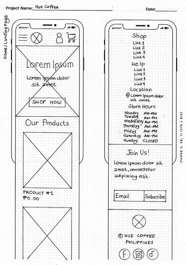
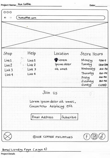
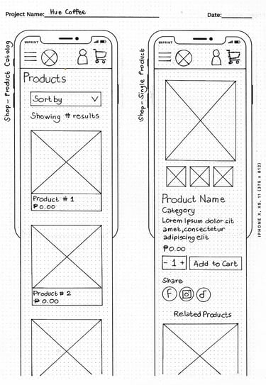
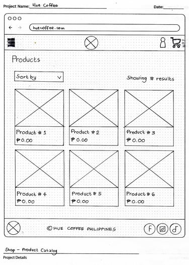
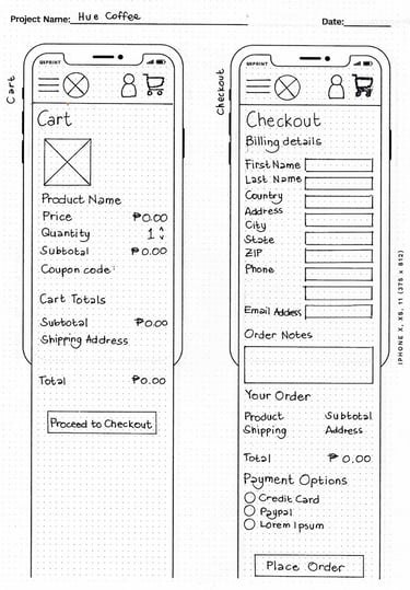
mid-fidelity prototype
The paper wireframes were refined into a mid-fidelity prototype, focusing on structure and functionality without detailed visuals. This stage allowed me to test navigation, ordering flow, and page hierarchy, ensuring the process of browsing the menu and placing an order felt clear and efficient before moving on to high-fidelity design.
mid-fidelity wireframes
mid-fidelity prototype
☕️ Design
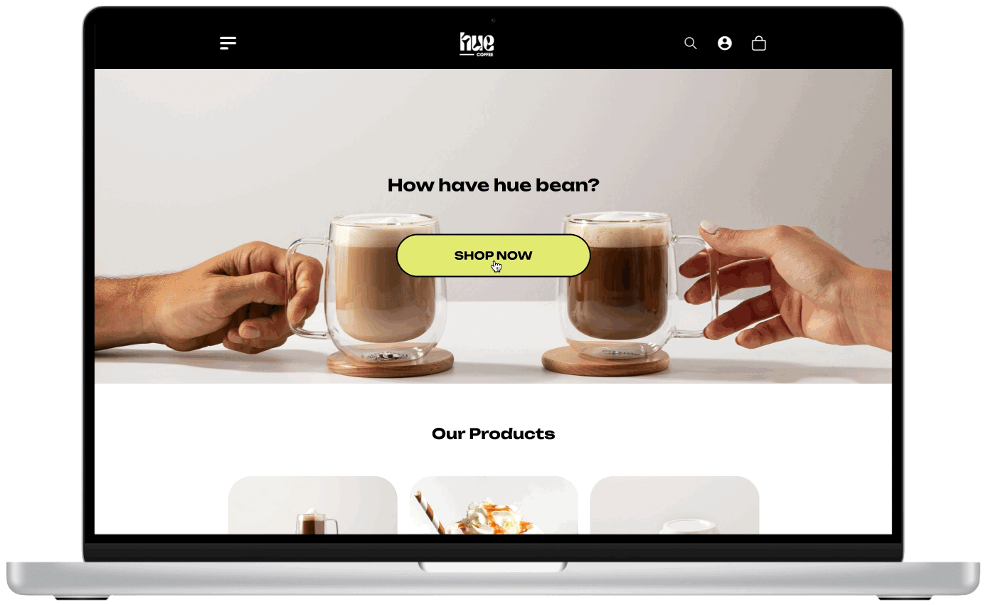
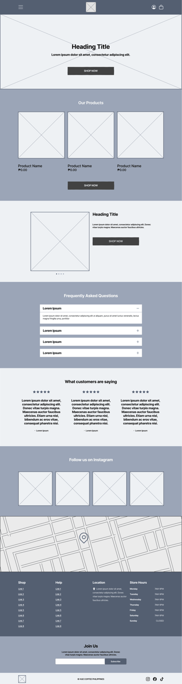
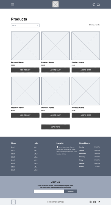
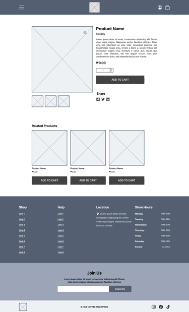
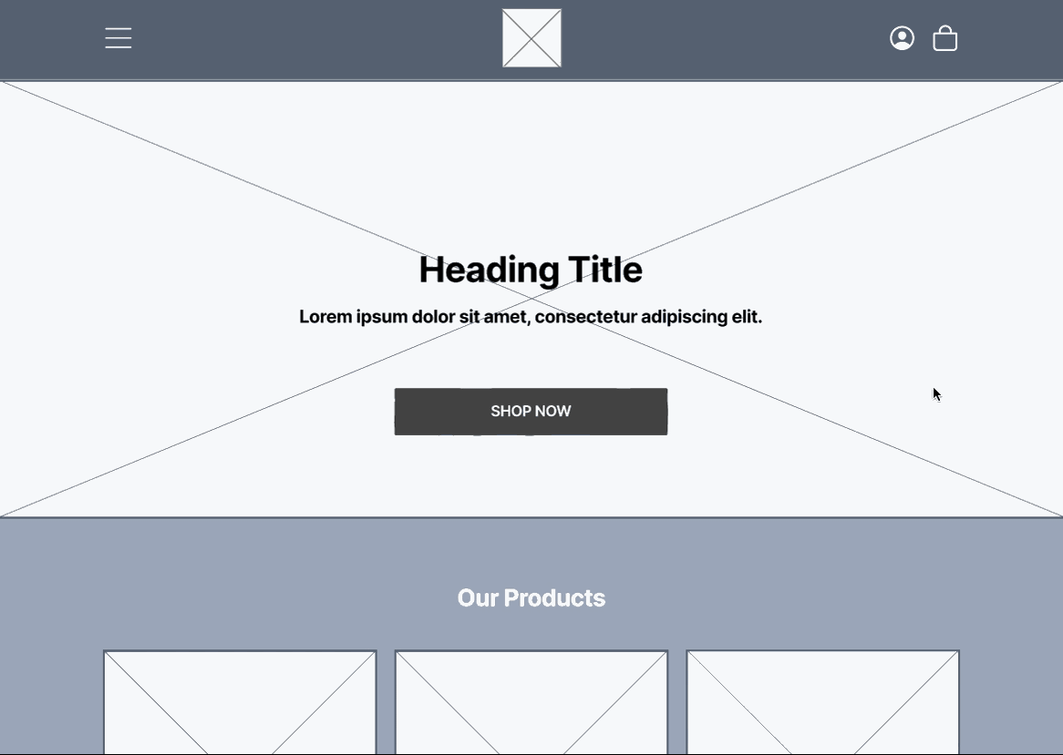
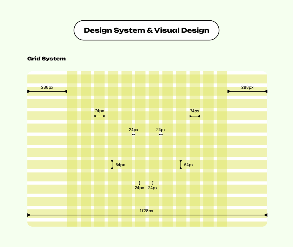
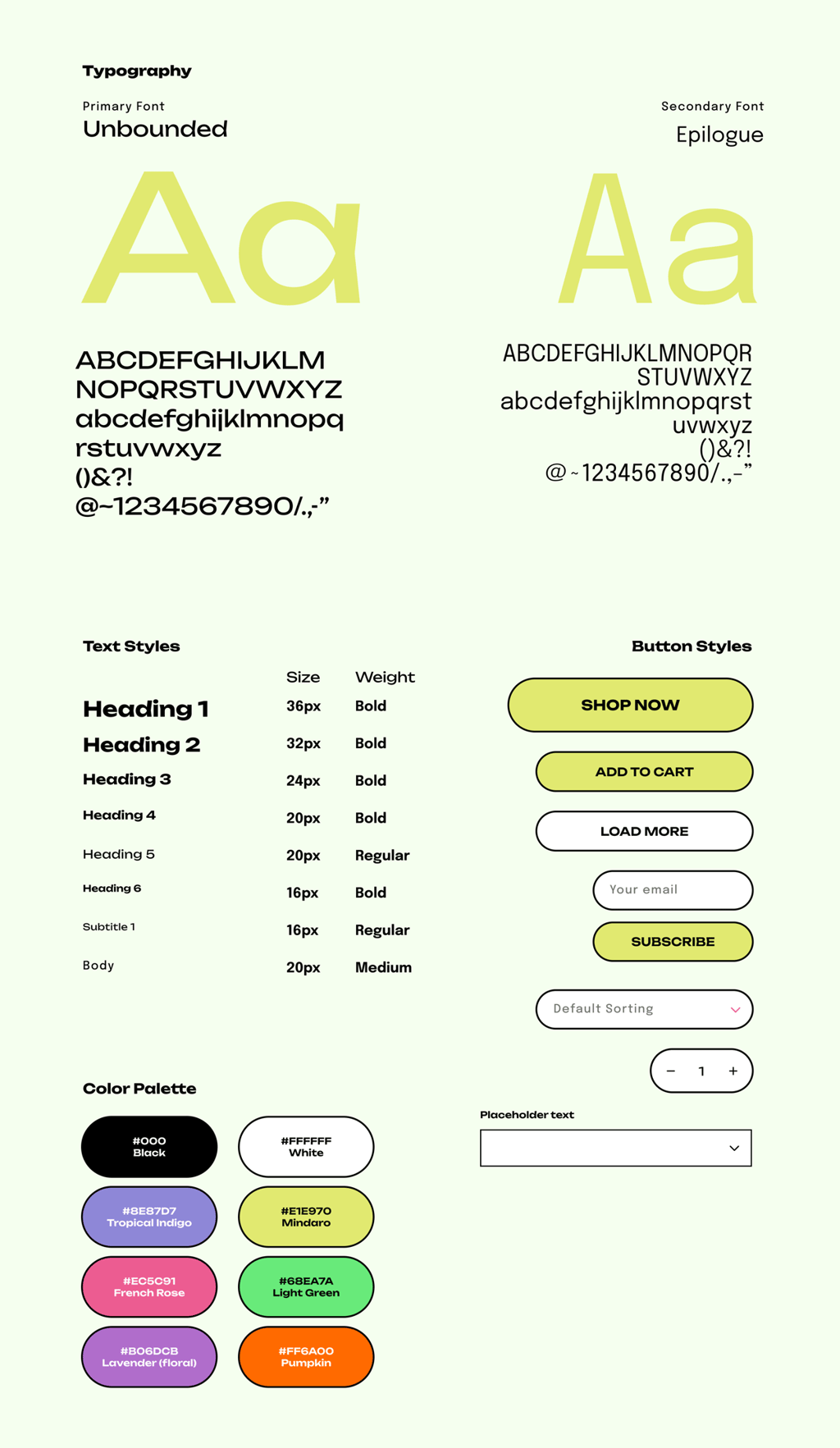
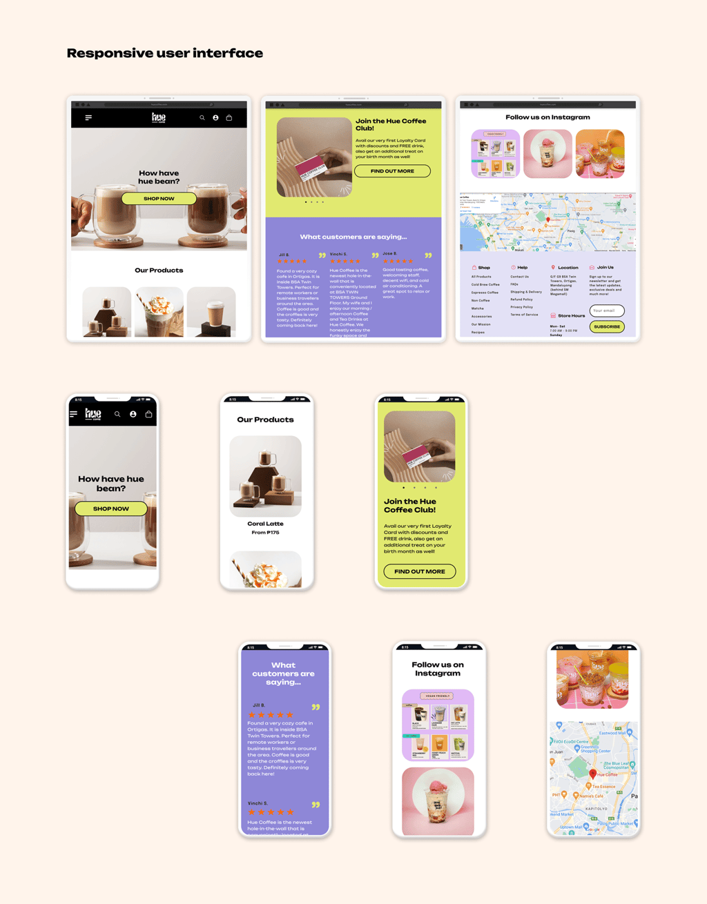
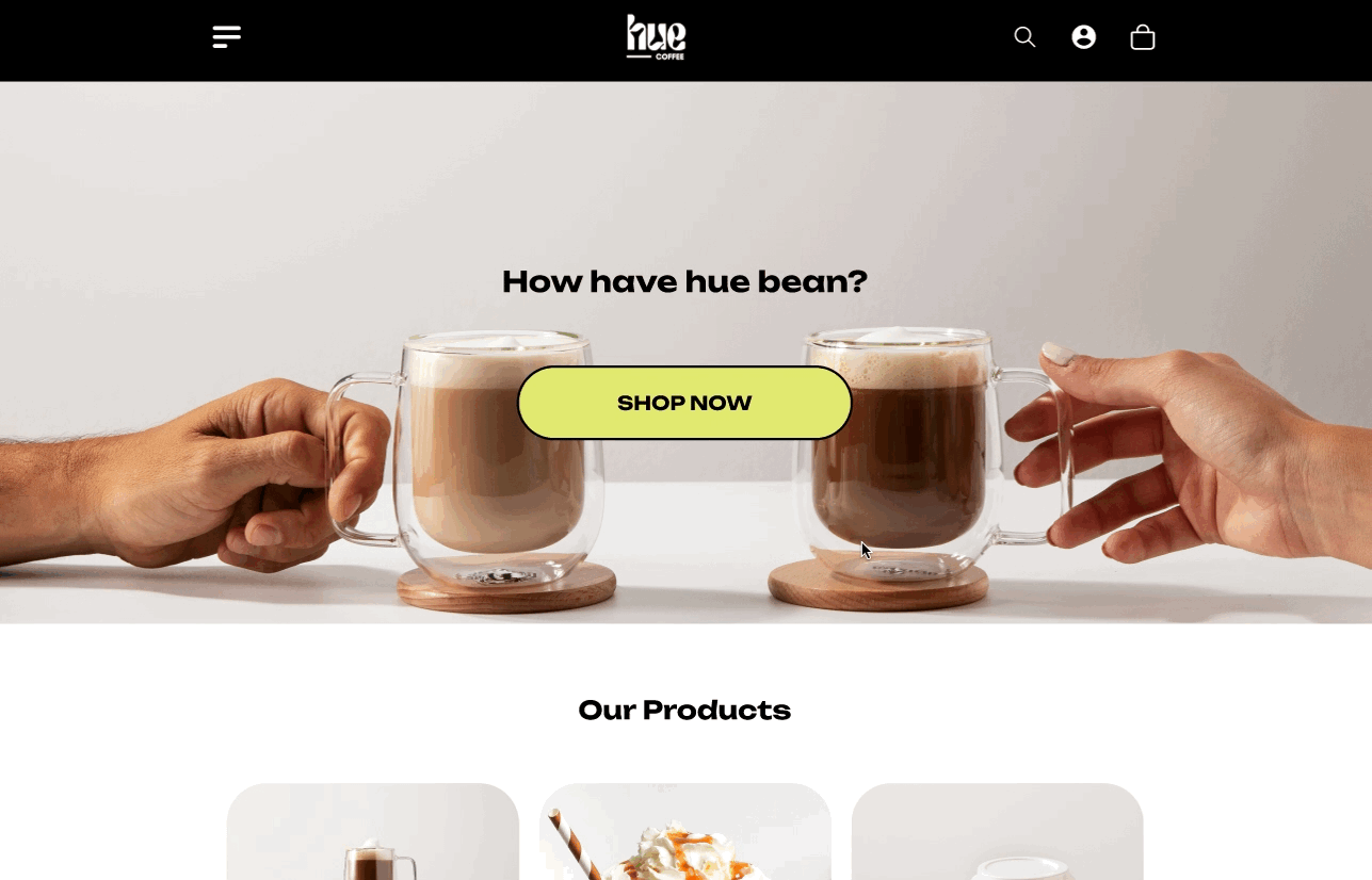
In the design stage, I developed a UI design that highlights Hue Coffee's fun and friendly personality. A pastel color palette was chosen to create a light, welcoming atmosphere, paired with clean typography and playful accents that reflect the cafe's approachable charm. The design was also built with responsive layouts, ensuring the website looks and works beautifully across mobile, tablet, and desktop. This makes browsing the menu and placing orders not only convenient but also visually enjoyable for every customer.
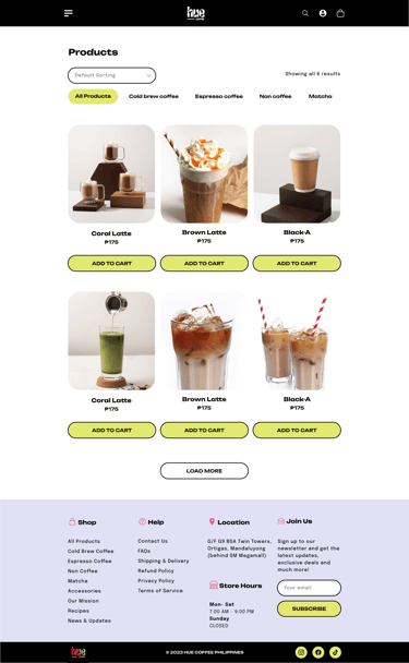
ui design
The UI design uses a pastel color palette to create a fun, friendly, and welcoming atmosphere. Clean typography and simple layouts keep the focus on the menu and ordering flow, while playful accents reflect Hue Coffee's approachable brand identity.

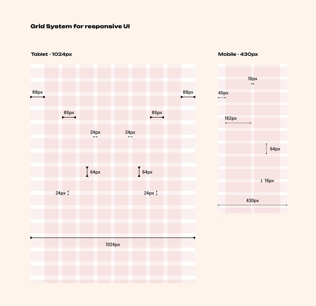
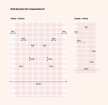
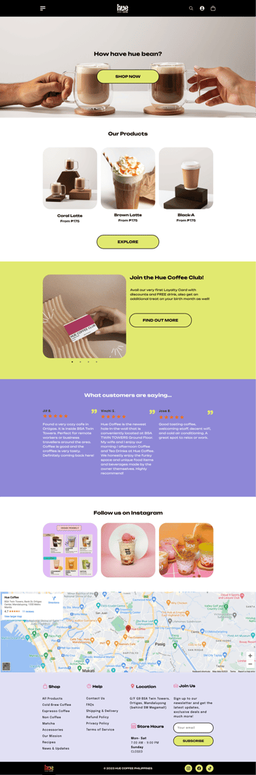
responsive design
The website was designed with a responsive layout, ensuring it adapts seamlessly across mobile, tablet, and desktop. This guarantees that customers can easily browse the menu and place orders anytime, anywhere, with a consistent and user-friendly experience.

☕️ Testing
The testing stage began with a usability study to observe how users navigated the website, browsed the menu, and placed orders. Feedback highlighted areas for improvement. Based on these insights, several revisions were made to improve clarity, speed, and overall usability. These refinements led to the creation of the final high-fidelity prototype, which combined Hue Coffee's friendly pastel branding with a smooth, intuitive ordering experience that met both customer needs and business goals.
usability study
To evaluate the website's flow and ease of use, I conducted a usability study with participants who reflected Hue Coffee's main audience—students, commuters, and young professionals. Users were asked to complete key tasks such as browsing the menu up to placing an order for pickup.
key insights


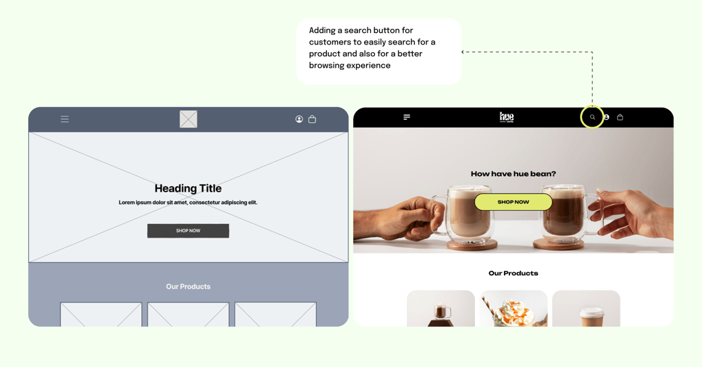
Search Functionality
Users had difficulty locating specific drinks, suggesting the need for a search button within the menu.

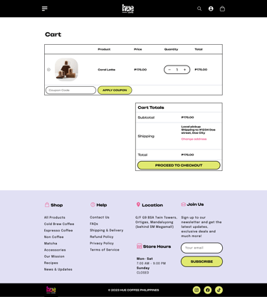
Cart Interaction
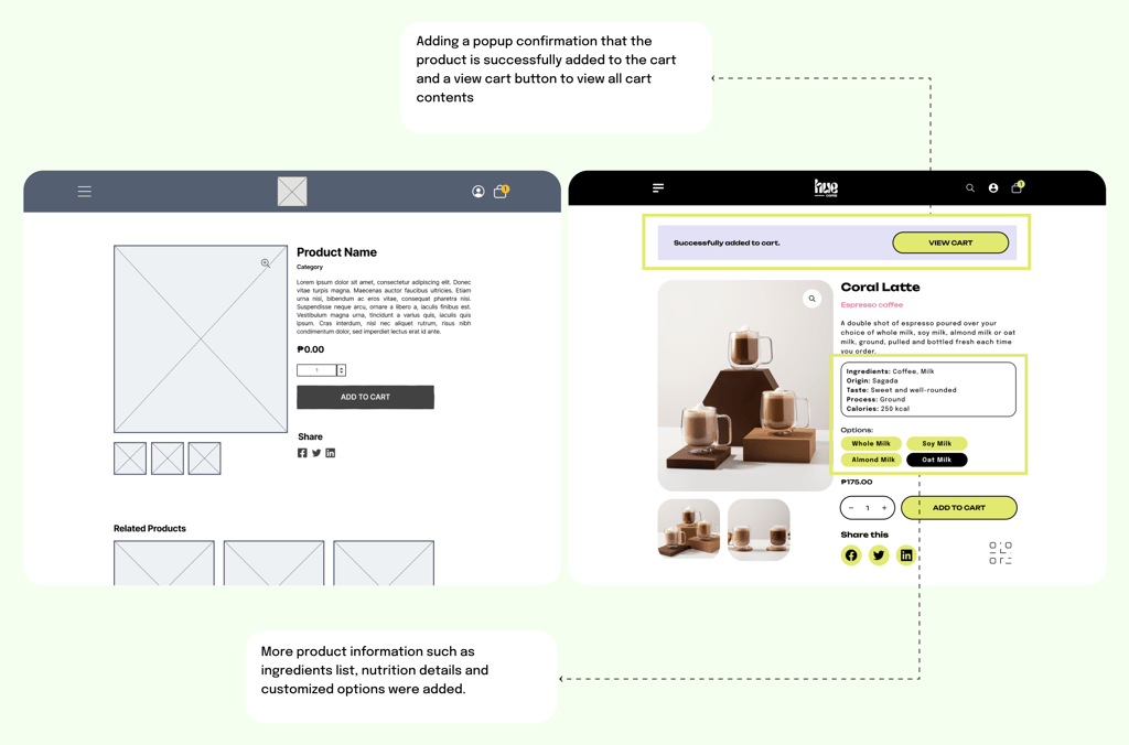
Some participants were unsure if an item was successfully added to the cart, leading to the recommendation of a popup confirmation and a more visible "View Cart" button.

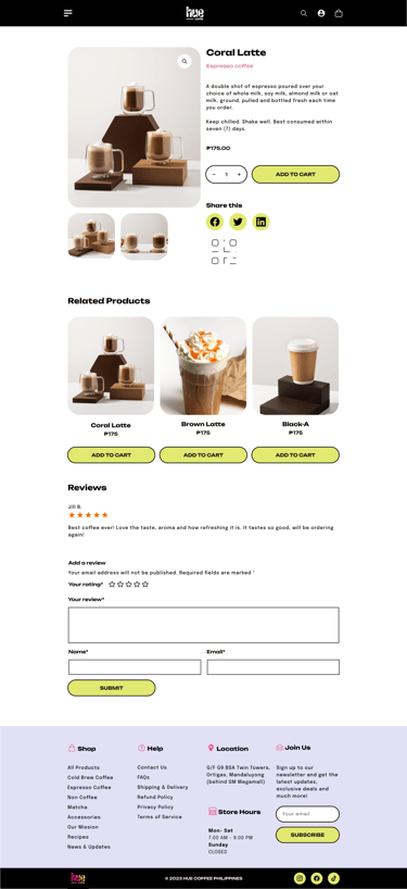
Product Information
Users wanted clearer details on individual drink pages, such as ingredients or sizes, to feel more confident in their selections.
revisions
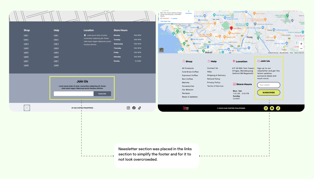
Following the usability study, key revisions were made to improve clarity and efficiency in the ordering process. A search button was added to the menu to help users quickly find specific drinks. To reduce uncertainty, a popup confirmation now appears whenever an item is added to the cart, along with a visible "View Cart" button for easier access. The product pages were also updated with more detailed information, such as ingredients and size options, giving customers greater confidence in their choices. Additionally, the newsletter signup was moved into the links section to simplify the overall design and reduce clutter on the main pages. Together, these refinements created a smoother, more intuitive, and user-friendly experience.
revision 1: adding a search menu
revision 2: adding a popup confirmation and view cart button

revision 3: moving the newsletter signup

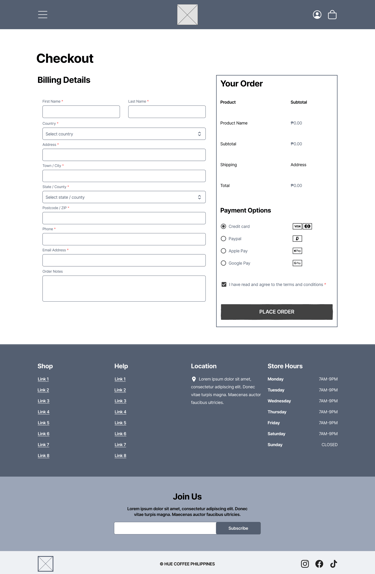
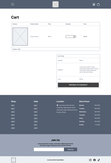
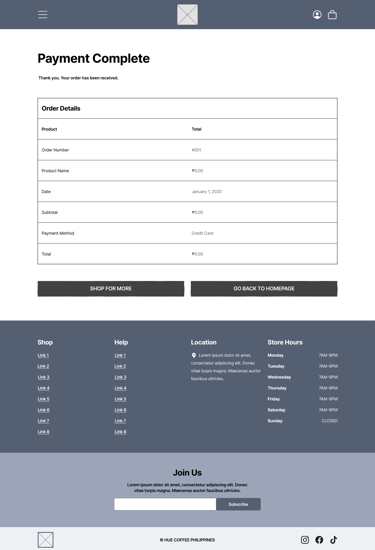
final high-fidelity prototype
The final high-fidelity prototype brought together Hue Coffee's friendly pastel branding with a streamlined, user-centered ordering system. Optimized for both desktop and mobile, the final design delivered a fun, friendly, and efficient experience that aligned with Hue Coffee's goal of making coffee pickups easier and more enjoyable.
high-fidelity wireframes
high-fidelity prototype
One key revision was the addition of a search menu on the website. This feature addressed user feedback about difficulty finding specific drinks and menu items. By making search readily available, customers can now quickly locate their favorites or discover new items without scrolling through the entire menu, making the ordering process faster and more convenient.
To improve clarity during the ordering process, a popup confirmation was added whenever a product is placed in the cart. This reassures customers that their action was successful. Along with it, a "View Cart" button was introduced for quick access, giving users more control and transparency while shopping.
The newsletter signup was moved into the links section at the bottom of the site to simplify the overall layout. This kept the main pages focused on the ordering process while still making the signup option accessible for customers who want updates and promotions.
☕️ Looking Ahead
I learned how small details, like adding a search bar or a cart popup, can make a huge difference in usability.
Testing showed me how important it is to listen to real users and adjust designs based on their needs.
Using Hue's color palette reminded me how design choices can capture a brand's personality and make it more approachable.
This project reinforced that design isn't just about how things look; it's about making everyday tasks easier and more enjoyable.
Hue Coffee's website has been designed with scalability in mind, ensuring it can grow alongside the cafe's needs. Future opportunities include adding delivery services, a loyalty program, and an online store for merchandise. These features will expand customer reach while maintaining the same fun, friendly, and convenient experience.
takeaways
next steps
Conduct another round of usability testing with the final prototype to validate improvements.
Gather feedback directly from Hue Coffee's customers to refine the experience further.
Explore adding new features like delivery options, loyalty rewards, and an online store.
Continue evolving the design to keep it simple, fun, and aligned with Hue Coffee's brand as the cage grows.
Let’s start your next project together.
ⓒ 2025 — Guylaine Bernardez