Designing a seamless pet adoption app and website
🐾 Project Overview
Pawmily is a digital platform designed to simplify and enhance the pet adoption process. The app connects potential pet adopters with shelters, rescue organizations, and foster homes, making it easier to find a furry companion that fits their lifestyle. With its intuitive design and user-friendly features, Pawmily promotes responsible pet adoption while supporting animal welfare communities.
Duration
My Role
Tools
The Challenge
Objective/Goal
8-12 weeks
UX/UI Design, Visual design, Branding, User flow, Research, Prototyping, and Testing
XD, Miro, Zoom, Google Forms
Adopting a pet is often a long, confusing, and overwhelming process. Many potential adopters struggle with scattered information, outdated listings, and unclear requirements from different shelters and organizations. On the other hand, animal shelters face difficulties in showcasing their pets effectively and managing large volumes of inquiries. This disconnect not only slows down the adoption process but also leaves many animals waiting longer to find their forever homes. Pawmily was created to bridge this gap, offering a platform that makes adoption easier, more transparent, and more accessible for everyone involved
To create a seamless, trustworthy, and compassionate platform that connects potential adopters with shelters and rescue groups. By centralizing adoptable pet profiles, simplifying the application process, and offering educational resources, the app aims to:
Make pet adoption more accessible, transparent, and efficient.
Empower shelters and rescues with tools to manage and promote their adoptable pets.
Encourage responsible pet ownership by providing guidance and resources to adopters.
Ultimately, reduce the number of homeless animals by helping more pets find safe, loving, and permanent homes.
My Design Process
User Research
Personas
Problem Statements
Competitive Audit
Ideation
Digital Wireframes
Low-fidelity Prototype
Usability Study
UI Design
Revisions
Accessibility Considerations
High-fidelity Prototype
Sitemap
Prototypes
Takeaways
Next Steps
🐾 Understanding the User
To design an adoption platform that truly meets the needs of both adopters and shelters, we began by conducting user research to uncover common frustrations, motivations, and expectations in the pet adoption journey. Through interviews and surveys, we developed user personas that represented key groups. These personas helped us frame clear problem statements, highlighting issues like the lack of centralized information, difficulties in comparing pets across platforms, and the emotional stress of unclear adoption processes. A competitive audit of existing adoption apps and websites further revealed gaps in usability, transparency, and user engagement. Guided by these insights, we moved into the ideation phase, where we explored solutions that could simplify the adoption journey, enhance trust, and create a more supportive experience for both adopters and animal welfare organizations.
user research
Our research focused on understanding the experience of both potential adopters and animal shelters. Through surveys, interviews, and observation of existing adoption processes, we identified key pain points and opportunities for improvement. These insights shaped the foundation of Pawmily, guiding us to design a solution that prioritizes transparency, ease of use, and a supportive experience for all stakeholders.
key findings


Adopters' Pain Points
Scattered and outdated pet listings across multiple platforms
Unclear adoption requirements and processes leading to confusion.
Overwhelmed by emotional and logistical challenges in choosing the right pet.
Shelters & Rescues' Pain Points
Difficulty managing multiple adoption inquiries efficiently.
Limited tools to effectively showcase pets online.
Lack of streamlined communication with potential adopters.
Opportunities Identified
Centralize adoptable pet profiles in one accessible platform.
Simplify and guide the adoption process with transparency.
Provide shelters with better digital tools for management and outreach.
Offer educational resources to support responsible pet ownership.
personas
To better understand the needs of our users, we developed two key personas: Sofia, a first-time adopter who feels overwhelmed by scattered and unclear adoption processes, and Mark, a busy professional who values convenience and clear information when browsing available pets. These personas helped me stay focused on user needs, guiding decisions around search, filtering, and accessibility to ensure the experience was both intuitive and supportive.


Sofia the Student
First-Time Adopter
Age: 22
Occupation: College student, part-time barista
"I really want a pet, but the adoption process feels so complicated. I wish there was one place where I could find everything I need and be sure I'm making the right choice."
Problem Statement:
Sofia needs a simple and transparent way to browse available pets and understand the adoption process because she feels overwhelmed by scattered, unclear, and outdated information online.


Mark the Pet Lover
The Busy Professional
Age: 29
Occupation: Software Developer
"I don't have much time to search everywhere; I just want a simple way to find the right pet near me."
Problem Statement:
Mark needs a quick and reliable way to discover available pets nearby because his busy schedule makes it difficult to navigate scattered and outdated adoption platforms.
competitive audit
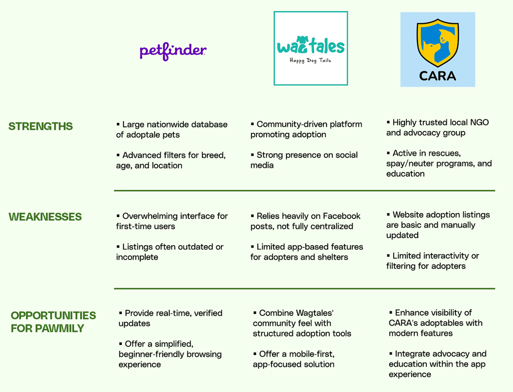
To identify gaps and opportunities in the pet adoption landscape, I conducted a competitive audit of existing platforms such as Petfinder and local shelter websites. While these platforms provide extensive pet listings, many lack user-friendly navigation, personalized recommendations, or streamlined application processes. Some rely heavily on outdated data, leading to frustration for adopters, while others offer limited tools for shelters to manage inquiries effectively. These findings revealed a clear opportunity for Pawmily to differentiate itself by combining intuitive design, real-time updates, and integrated tools that serve both adopters and shelters, creating a more supportive and efficient adoption experience.
ideation
In the ideation stage, I used paper sketches to explore different layouts for the app, focusing on how users would search for pets and view available listings. I experimented with home screen structures that highlighted search filters, categories, and nearby pets, making it easy for adopters to quickly find companions that matched their lifestyle. Sketching also helped me test layouts for pet profiles, ensuring key details such as age, health, and location were clear at a glance.
🐾 Starting the Design
After refining my paper sketches, I moved on to creating digital wireframes to establish the core structure of the app. I focused on essential features such as searching for pets, browsing nearby listings, and viewing detailed pet profiles. From there, I built low-fidelity prototypes to map out user flows and test how adopters would navigate the app from search to application. To validate these early designs, I conducted a usability study with potential adopters and shelter staff, which gave me valuable insights on clarity, navigation, and overall experience. Their feedback guided my next iterations, helping me shape a design that was both intuitive and user-centered.
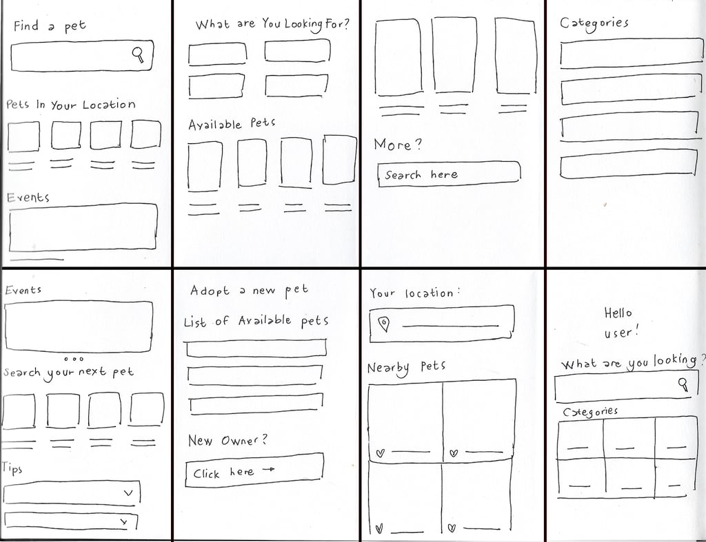
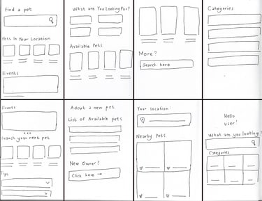
digital wireframes
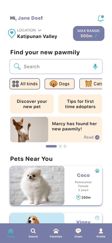
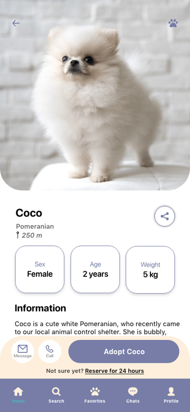
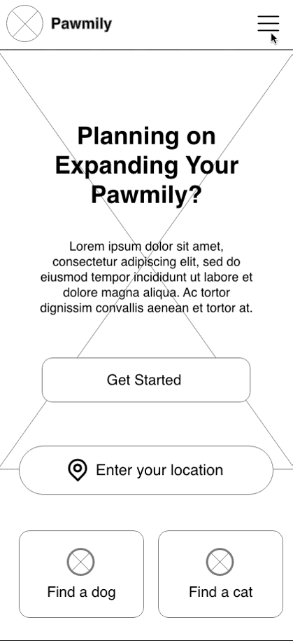
When I started building the digital wireframes, my goal was to translate the initial sketches into clear structures that captured the core functions of the app. I focused on designing a clean layout for the home screen with prominent search and filter options, as well as sections that highlighted pets available nearby. For the pet profiles, I prioritized readability by organizing key details like age, health status, and location in a way that adopters could quickly scan. At this stage, I kept the design minimal and low-detail, concentrating on functionality and flow rather than visuals, which made it easier to refine the structure before moving into high-fidelity wireframes.
low-fidelity prototype
After building the digital wireframes, I connected the screens into a low-fidelity prototype to simulate the core user flows. This allowed me to test how adopters would search for pets, apply filters, and browse nearby listings, as well as how shelters could showcase pet details. By keeping the prototype simple and without visual polish, I was able to focus on functionality and navigation. This stage helped me quickly identify pain points in the flow and gather early feedback before moving into more detailed design work.
usability study
Once I had the low-fidelity prototype, I conducted a usability study with potential adopters to see how well the design supported their needs. I asked participants to complete key tasks such as searching for a pet near their location, applying filters, and reviewing a pet profile. The study revealed valuable insights that helped me refine the user flows and prioritize improvements before moving forward with higher-fidelity designs.
parameters
Study Type
Unmoderated usability study
Participants
10 participants
Location
Remote
Length
20-30 minutes
findings


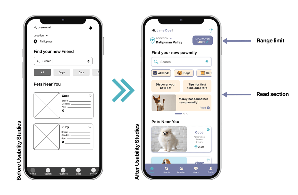
Location
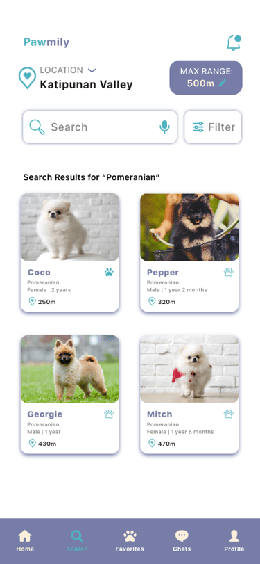
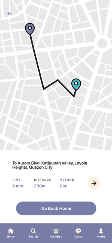
Users wanted a range limit based on their location

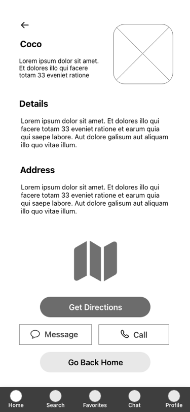
Read Section
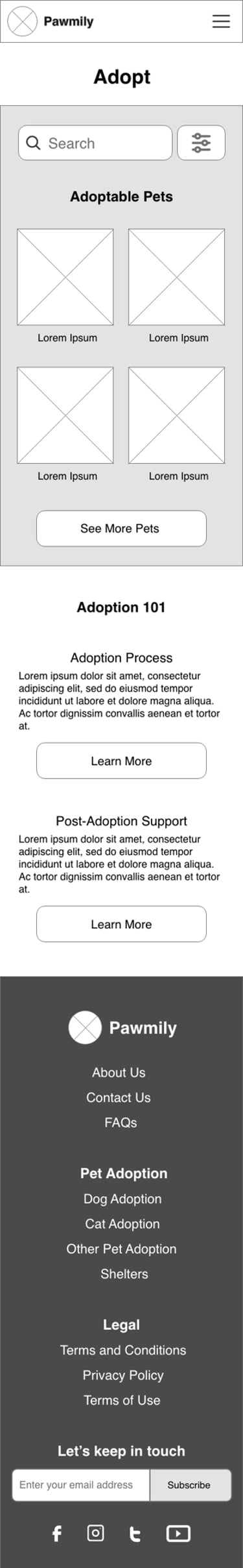
Users would like to have a read section that would be beneficial in giving more awareness in adopting

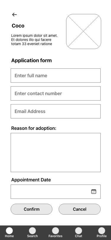
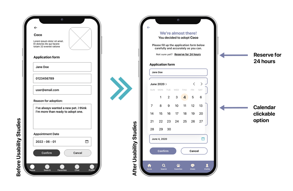
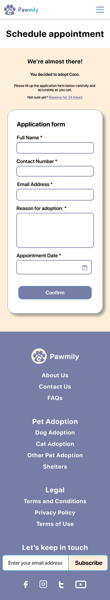
Application Form
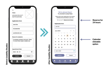
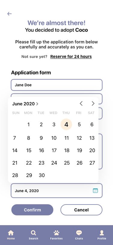
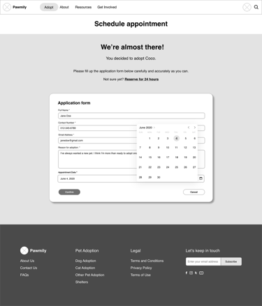
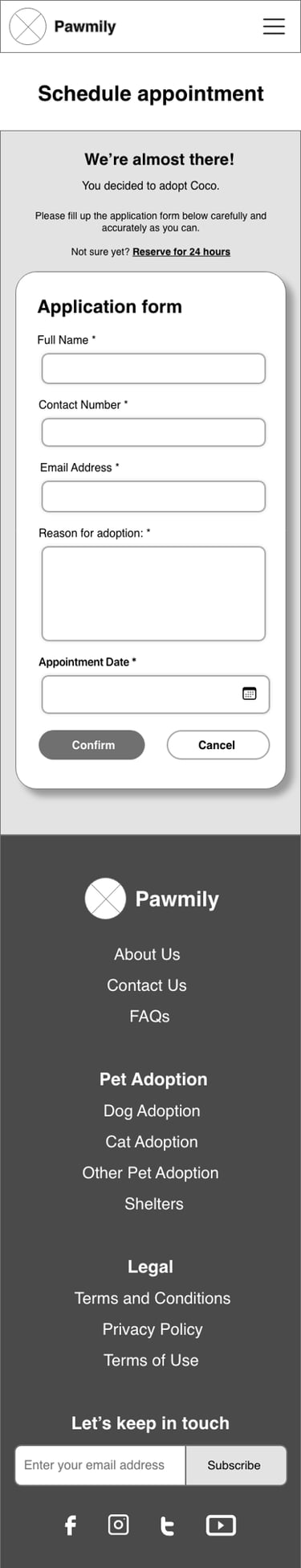
Users preferred a calendar-type clickable option on the appointment date field and and an additional option in the reservation
🐾 Refining the Design
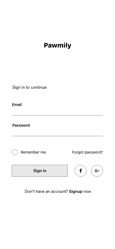
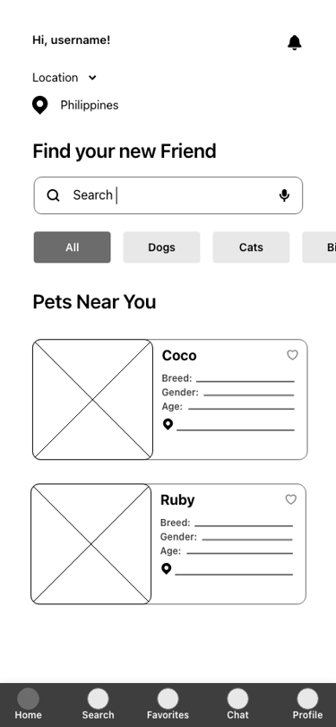
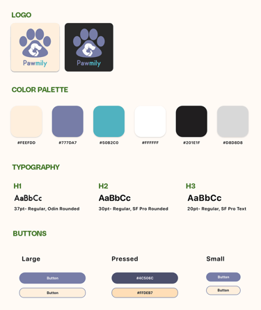
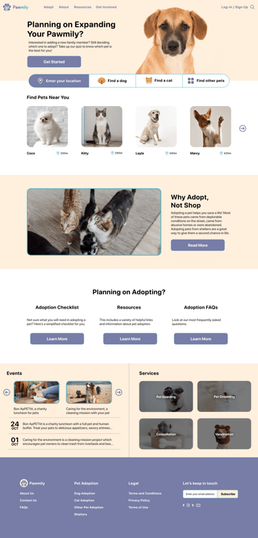
After addressing the insights from the usability study, I moved into refining the design by focusing on the UI and visual elements. I introduced a clean and approachable style with soft colors, rounded components, and intuitive typography to create a friendly experience that reflects the warmth of pet adoption. I then developed a high-fidelity prototype to bring these visuals and interactions to life, allowing users to experience the app in a more realistic way. Throughout this stage, I also took note of some accessibility considerations for the users. This refinement phase helped transform the functional flows into an engaging and inclusive experience that felt both practical and emotionally resonant.
ui design
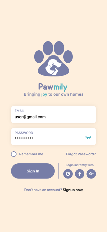
When I started working on the UI design, my goal was to make the app feel warm, approachable, and easy to use. I chose a clean layout with soft colors, rounded elements, and playful yet professional typography to reflect the friendly nature of pet adoption. I also paid attention to hierarchy, ensuring that important details like the pet's age, health, and location stood out at a glance. By balancing visual appeal with clarity, I aimed to create an interface that not only looked inviting but also made the adoption process feel less intimidating and more joyful.

usability study revisions
After gathering insights from the usability study, I revised the wireframes and low-fidelity prototype to address the issues users encountered. With these refinements, I moved into the high-fidelity design, applying the final color palette, typography, and visual style. The result was a realistic, interactive prototype that not only incorporated usability feedback but also captured the approachable and trustworthy personality I wanted Pawmily to convey.
revision #1: adding range limit & read section
revision #2: adding a reserve option
high-fidelity wireframes
experience the prototype
accessibility considerations
Accessibility was a key part of the design process to ensure that Pawmily could be used by as many people as possible. By integrating these accessibility practices early, I aimed to create an adoption experience that is inclusive, user-friendly, and welcoming to all.

Provided a speech recognition feature in the easy search function for users who have mobility impairments to use
Used icons and labels to help make navigation easier
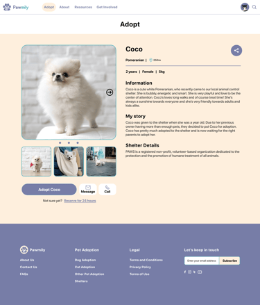
Provided access to users who are visually impaired by adding alt text to images for screen readers
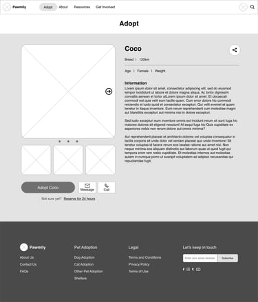
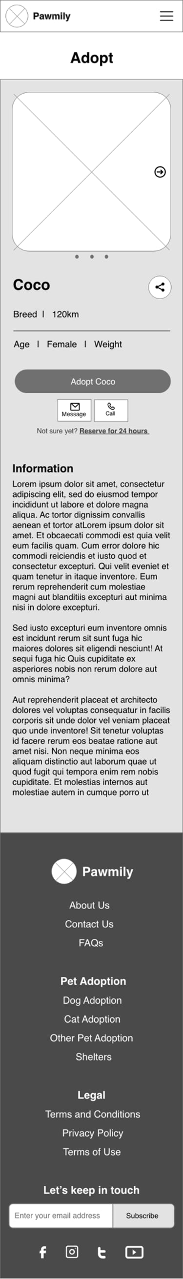
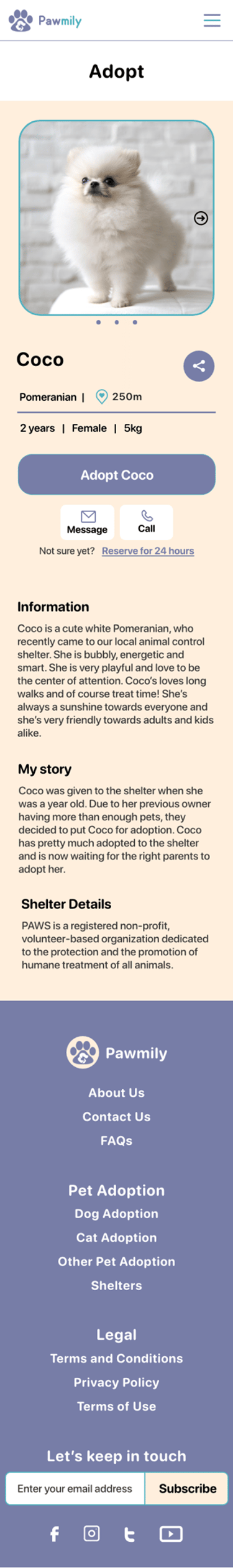
Used detailed imagery for pets to help users better decide on which pet to adopt
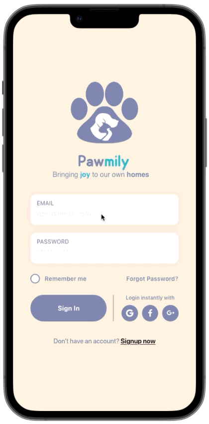
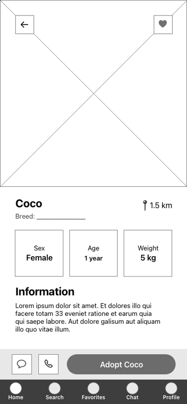
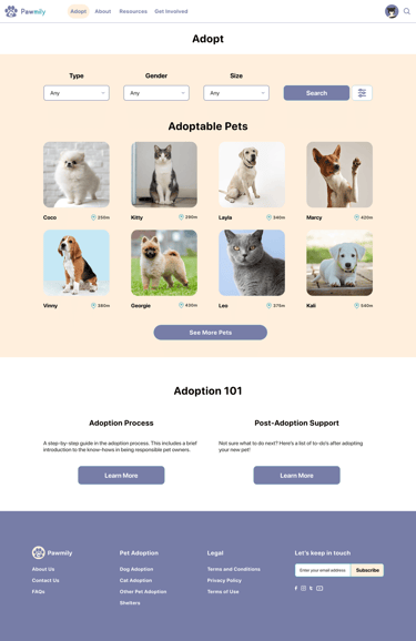
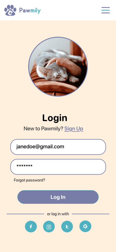
high-fidelity prototype
The final high-fidelity prototype brought together all the design refinements, usability findings, and accessibility considerations into a polished, interactive experience. I focused on creating smooth user flows for searching and filtering pets, browsing nearby listings, and filling out the application form.
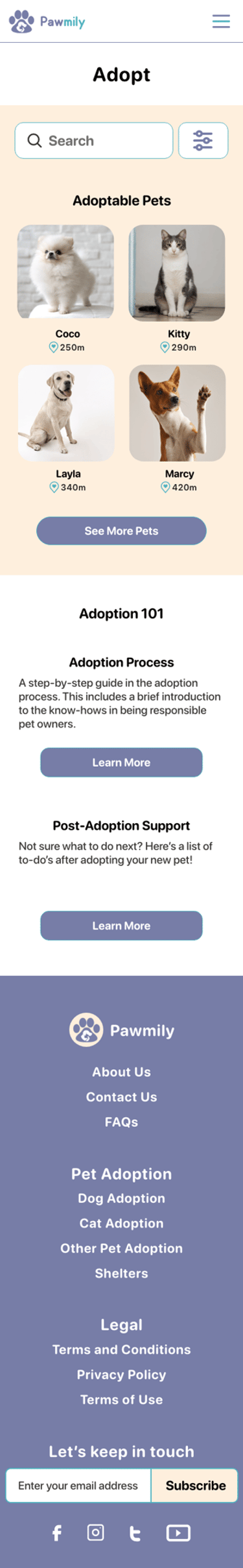
For the first revision, I added a range limit to help users filter pets by distance, making it easier to find adoptable pets nearby. I also included a dedicated "Read" section with resources and guides to support adopters with helpful information throughout the adoption journey.
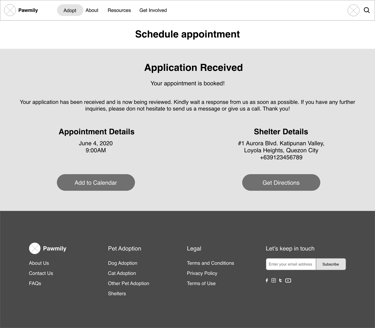
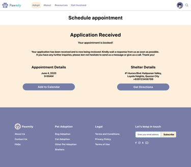
In the second revision, I introduced a "Reserve" option that allows users to express interest in a pet before finalizing the adoption process. This feature helps streamline communication with shelters and gives adopters peace of mind knowing their chosen pet is being considered for them.
🐾 Responsive Design
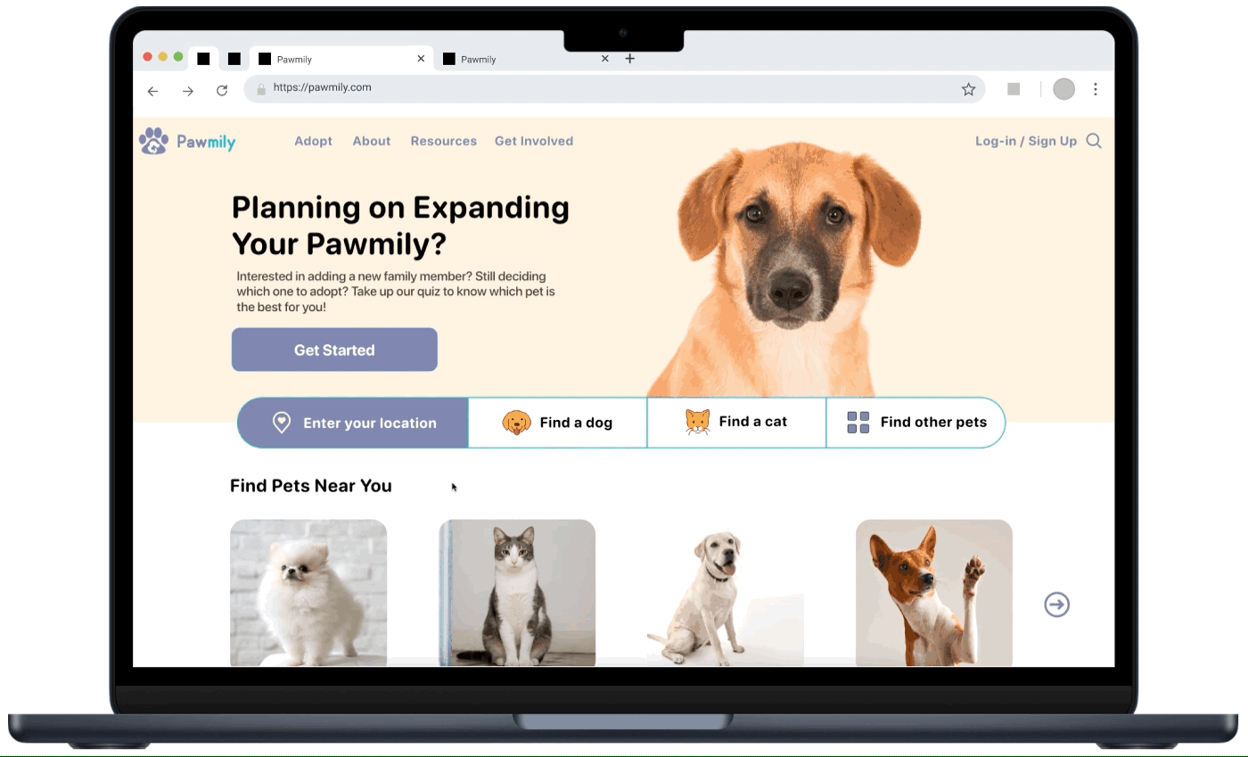
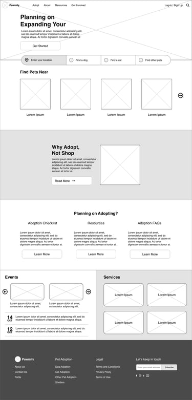
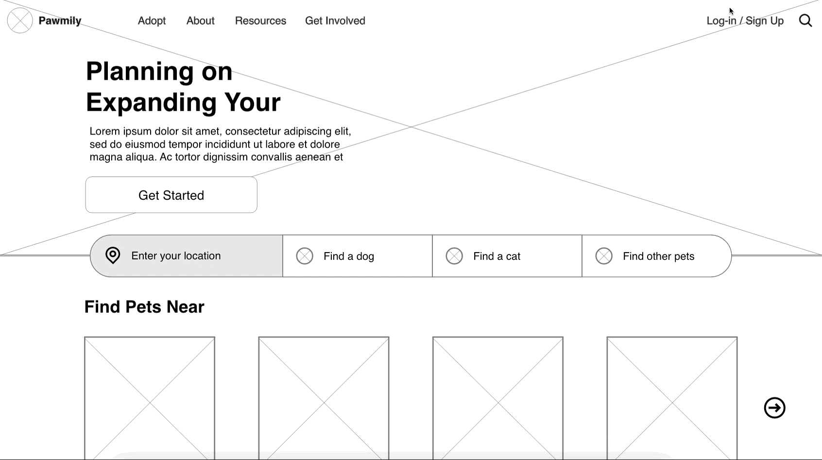
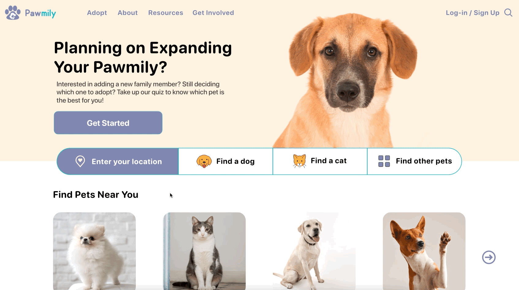
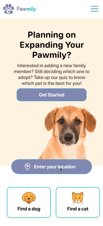
After completing the app prototype, I extended the design into a responsive website to make Pawmily accessible across different devices. To guide this process, I first created a sitemap that outlined the key pages and user flows. From there, I adapted the layouts to work seamlessly on desktop, tablet, and mobile, ensuring that features like search filters, pet listings, and profile details remained easy to use regardless of screen size. On larger screens, I used grid-based layouts to showcase more pets at once, while on smaller devices I simplified navigation and emphasized clarity for quick browsing. This responsive approach allowed the platform to provide a consistent and user-friendly experience, whether someone is adopting from their phone on the go or browsing at home on a computer.
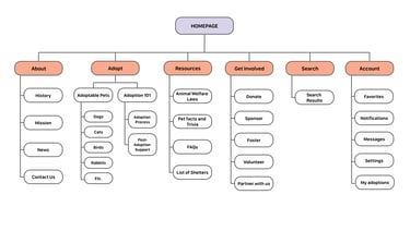
sitemap
To establish a clear information structure for Pawmily, I created a sitemap that mapped out the key pages and user flows. Building the sitemap in the design process helped me visualize the hierarchy of information and ensure that users could move through the platform with ease, whether they were browsing casually or actively applying to adopt a pet.

prototypes
For the website version of Pawmily, I created wireframes and prototypes for both desktop and mobile to ensure a consistent experience across devices. I began with mid-fidelity prototypes to define the structure and layout, then advanced to high-fidelity prototypes that showcased the final visuals, interactions, and responsive behavior. This process helped me refine the design and deliver a seamless, user-friendly experience on any screen size.
mid-fidelity wireframes
mid-fidelity prototype
I created the mid-fidelity prototype for the website by building on the existing app design, carrying over key layouts and user flows like searching, filtering, and viewing pet profiles. This stage focused on adapting the structure for larger screens while keeping the experience consistent and intuitive across both platforms.


high-fidelity wireframes


high-fidelity prototype
For the high-fidelity prototype, I refined the mid-fidelity design by applying the final colors, typography, and visual style established in the app. This allowed me to bring the website version to life with a polished, responsive look while ensuring consistency with the mobile experience.
🐾 Going Forward
User-centered design matters: I learned how important it is to understand adopters' needs and balance them in one platform.
Early testing saves time: Paper sketches and low-fidelity prototypes uncovered usability issues that guided smarter design decisions.
Accessibility is essential: Designing with color contrast, readable typography, and clear navigation made the platform more inclusive.
Iterative design improves outcomes: Each cycle of feedback and refinement brought the product closer to being intuitive and effective.
Design can drive impact: This project reinforced how thoughtful digital design can solve real-world challenges, like helping pets connect with their future families.
Designing Pawmily taught me the importance of empathy, accessibility, and iterative testing in solving real problems.
takeaways
next steps
Conduct deeper research on shelters' perspectives to better understand their needs in managing pet listings and applications.
Integrate adoption events so users can discover upcoming opportunities to meet pets in person.
Add personalized recommendations to match adopters with pets that fit their lifestyle and preferences.
Refine shelter tools to make posting, updating, and managing adoption applications more efficient.
Continue usability testing to gather feedback from both adopters and shelters, ensuring the platform remains intuitive and effective.
Let’s start your next project together.
ⓒ 2025 — Guylaine Bernardez